Brand guidelines: what they are, examples and how to create them
G. CHRIST
Published on November 6, 2026

You have a logo. You may even have an “official” blue in your head. Then sales sends a Canva flyer in another shade, an intern posts a WhatsApp status with a third typeface, the website still shows the old pictogram, and a donor pack arrives with a fourth spelling of the organisation name. That is not a taste problem. It is the absence of brand guidelines: the written operating manual for your visual identity.
At Guelichweb we see this constantly with SMEs, shops, NGOs and institutions across Francophone Africa: the brand lives in the founder’s memory, in a poorly named Google Drive folder, and in six versions of `final_v3_ok` logo files. The result is a digital presence that fails to look trustworthy — even when the service itself is solid.
In this guide we explain what corporate brand guidelines are, what they must contain beyond the logo, why they matter for WhatsApp, websites, print and donor files, how to create them (DIY, with a designer, or AI-assisted with human rules), common mistakes, a checklist and an FAQ. No invented “client” style guides. No invented prices on our side: for visual identity / a coherent website, we issue a quote after a diagnostic.
In short: brand guidelines are not a logo PDF. They are the rule system (logo, colour codes, typography, imagery, tone, do/don’ts, file pack) that keeps your brand recognisable on every channel. Without them, everyone improvises — and improvisation shows.
What are brand guidelines, exactly?
Brand guidelines (also called a brand style guide; in French, *charte graphique*) are a reference document that explains how to use an organisation’s visual identity. They answer the practical questions a freelance designer, a printer, a community manager or a new hire will ask: which logo on a dark background? which exact colour for the website button? which typeface for WhatsApp titles?
Keep three ideas separate:
- Logo — the distinctive mark (symbol, wordmark, monogram). One asset, not the system. See How to create a business logo.
- Visual identity — the set of graphic elements (logo, colours, type, shapes, photography…). This is “what you have”.
- Brand guidelines — the usage rules for that identity. This is “how you are allowed to use it”.
A brand book sometimes goes further: personality, mission, voice, sample messages. For a ten-person SME, a clear 8–15 page visual guide plus a tidy file pack beats an 80-page brand book nobody opens.
Watch the false friend: an [AI usage policy](/en/blog/ai-in-business-use-cases-ai-usage-policy) (internal rules for artificial intelligence) is not a visual style guide. They complement each other if you use AI to produce visuals — but they are different documents.
What a real set of brand guidelines contains
Forget the one-page PDF with a logo in the middle and “our colours: blue and orange”. A guide that actually helps a business covers at least the blocks below.
1. Logo: versions, clear space and prohibitions
List authorised variants: primary full-colour logo, monochrome, light/white version for dark backgrounds, icon-only version (favicon, WhatsApp / Instagram profile). Specify:
- Clear space around the logo — often equal to a letter height or a key symbol element.
- Minimum size in mm (print) and px (screen).
- Allowed and forbidden backgrounds.
- Don’ts: stretch, rotate, recolour freely, add a drop shadow “to make it pop”, place on a busy photo, rewrite the tagline.
Public guidelines from large brands (for example Spotify’s design documentation) insist as much on what not to do as on correct uses. That is deliberate: most damage comes from “small improvements” invented on the fly.
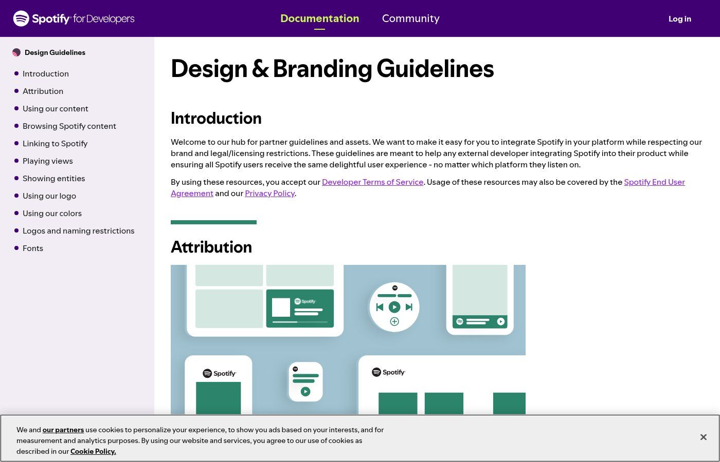
Source: Spotify for Developers — Design, captured 06/11/2026. A public example of documented brand rules (not a Guelichweb guide, not an invented client chart).
2. Colours: exact codes, roles and contrast
“More or less blue” does not exist in production. For each swatch document:
- HEX (web) — e.g. #0B3D91
- RGB (screens)
- CMYK (offset / flyers)
- optionally Pantone for spot-colour print
Give each colour a job: primary (brand), secondary, accent (buttons / CTAs), neutrals (text, backgrounds). A simple 60 / 30 / 10 split (dominant / support / accent) prevents carnival posters.
Test text/background contrast. WCAG guidance (at least 4.5:1 for normal text, 3:1 for large text) is a useful benchmark even outside Europe: an unreadable button on mobile kills WhatsApp or website conversions as surely as a weak logo.
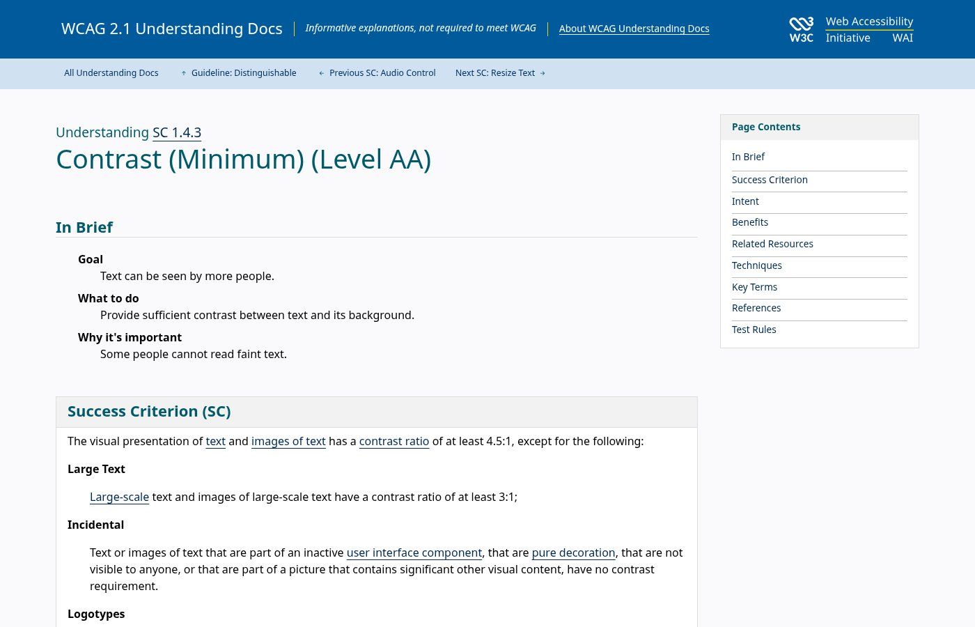
Source: W3C — Contrast (Minimum), captured 06/11/2026.
3. Typography
Two families are usually enough: one for headings, one for body text. Specify weights (Regular, Medium, Bold), typical sizes (H1, H2, body, caption) and fallbacks when the brand font is missing (especially useful for partners and PowerPoint decks).
For the web and shared documents, Google Fonts remain a pragmatic choice: clear licensing, easy install, consistency across site / PDF / Canva.
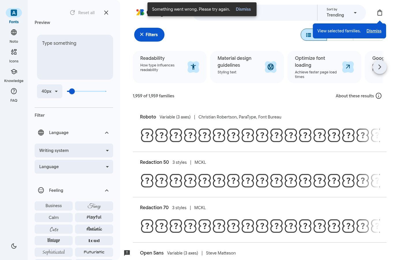
Source: Google Fonts, captured 06/11/2026.
4. Imagery, icons and graphic elements
Describe the photo style: natural or studio light, real people vs generic stock, framing, allowed filters. Add a coherent icon set (stroke, corner radius, weight) and, if needed, signature patterns/shapes. Without this section, every vendor brings “their” look — and your Instagram feed becomes a collage of five companies.
5. Voice and tone (even a short page)
A purely visual guide often ignores words. Yet on WhatsApp Business, LinkedIn or a website, tone is part of recognition. Three adjectives plus “we say / we don’t say” examples are enough for an SME. Example: “clear, direct, respectful — we avoid start-up jargon and magical promises”.
6. Do / don’t and channel templates
Show 3–5 correct applications (business card, Instagram post, email header, PDF cover, website banner) and as many incorrect ones. Where possible, provide editable templates (Canva Brand Kit, Figma, or locked Office files) so the team does not start from a blank canvas every time.
7. Files and formats
Guidelines without a file pack are theory. Prepare a shared folder with:
- Logo as SVG (vector) + high-resolution transparent PNG + PDF / EPS for printers
- Clearly labelled RGB and CMYK versions
- Font files or licence links
- Exported colour palette
- The guidelines PDF itself (reading version)
Name files like humans: `Brand_Logo_Primary_RGB.svg`, not `final_v12_last.psd`.
Why SMEs, NGOs and institutions in Francophone Africa need them
We sometimes hear: “We’re not Coca-Cola, we don’t need guidelines.” The opposite is true: the smaller and more multi-hatted the team, the faster assets drift.
- WhatsApp Business — catalogue, status, greeting message, labels: without rules, every salesperson invents a different banner.
- Website — inconsistent logo / buttons / headings reads as “cobbled together”, even when the code is clean.
- Print — flyers, banners, cards: printers need CMYK and minimum sizes, not a WhatsApp-compressed JPEG.
- Donor packs / tenders — a stable identity reassures. An NGO that changes logo with every annual report looks amateurish for the wrong reasons.
- Growth — new salesperson, digital agency, intern: guidelines stop you re-explaining the brand every month.
In Cotonou, Abidjan, Dakar or Douala, most client interactions still happen on mobile. Guidelines that ignore WhatsApp status (9:16) and profile photo (square) miss the most used channel.
Structure examples (without inventing fake client charts)
We do not publish fictional “client” style guides here. We can, however, learn from public structures and documented tools.
A practical SME outline (8–12 useful pages)
- Cover + version / date / brand owner contact
- One “who we are” page (3 adjectives, audience)
- Logo: variants + clear space + sizes + don’ts (visual)
- Colours: palette + codes + roles + contrast
- Typography: families, hierarchy, fallback
- Imagery + icons
- Tone (short) + WhatsApp / email examples
- Applications: web, social, print, email signature
- Annex: file list + Drive links
Canva Brand Kit: an operational mini-system
Canva officially documents Brand Kits: logos, colours, fonts and assets centralised so the team stays consistent. It is not a full PDF style guide, but it is often the first concrete lever for an SME that already produces everything in Canva.
Official Canva logo — source: Canva brand / help assets.
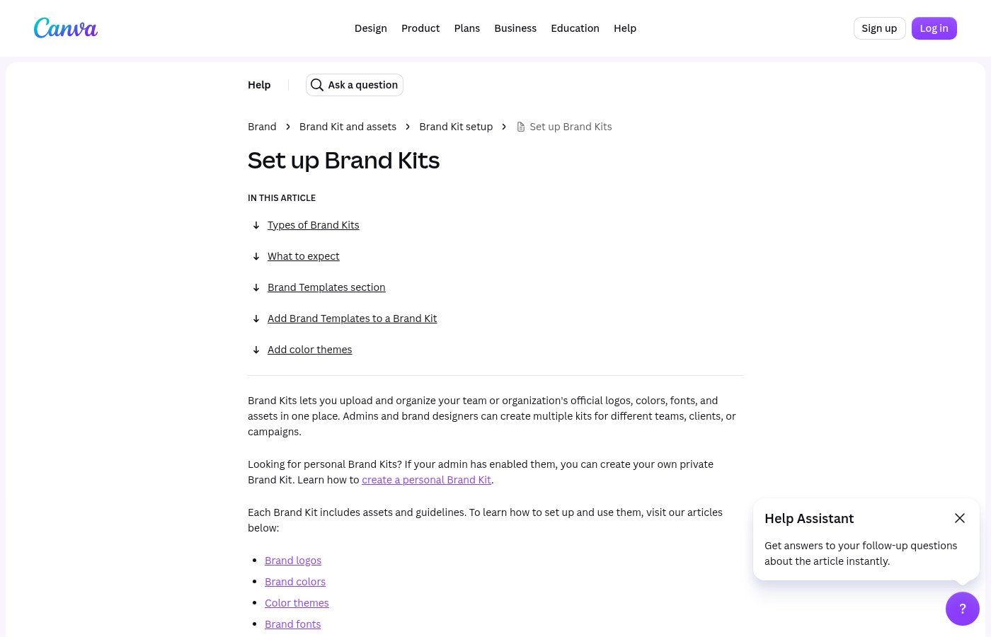
Source: Canva Help — Set up Brand Kits, captured 06/11/2026.
Source: Canva Pro, captured 06/11/2026. (French Pro page also available; same product family.)
Source: Canva Help — Trademarks & logo, captured 06/11/2026. For pricing and real limits, see also What is Canva?.
How to create brand guidelines (three realistic paths)
Path A — DIY (Canva / Google Docs), with discipline
Suitable if you are starting out, budget is tight, and the team is 1–5 people. Method:
- Audit two weeks of assets: website, WhatsApp, flyers, quote PDFs, email signatures. Screenshot the inconsistencies.
- Lock three personality adjectives (e.g. serious, accessible, precise).
- Freeze the logo: one master version + needed variants. If the logo is blurry or overly complex, read How to create a logo before documenting the chaos.
- Choose 4–6 colours max with HEX/RGB/CMYK codes. Test contrast.
- Two typefaces (Google Fonts) + a written hierarchy.
- Write the don’ts as images (even rough ones): this is the most useful part.
- Create a Canva Brand Kit + an 8-page read-only PDF.
- Train the team for 30 minutes: where files live, who approves exceptions.
DIY limits: Canva does not replace strategic identity work, “free” element licences have conditions, and a Brand Kit without written rules becomes another logo drawer. Pricing / limits: our Canva article.
Path B — With a designer or agency
Suitable if you are redesigning the website, launching a brand, answering tenders, or if DIY already produced three conflicting “guides”. A good brief includes: sector, audiences, priority channels (WhatsApp? print? web?), constraints (institutional colours, bilingual FR/EN), liked / disliked references, and the file pack required on delivery.
At Guelichweb, visual identity is not an isolated poster: it must hold on a website, forms, automations and daily usage. We start with a diagnostic, then a quote — never a magic price published in a blog post.
Path C — AI-assisted, human-ruled
AI speeds up moodboards, palette variants and first layouts. It does not invent a clear strategy if you lack one. Non-negotiable rules:
- One accountable person validates colours, logo and prohibitions.
- No “generated” logo without checking similarities / rights — see also our AI usage policy guide for internal tool use.
- Final colour codes and files are exported and versioned, not left inside a chat.
- AI templates are then constrained by the Brand Kit / guidelines, not the other way around.
Common mistakes (and how to avoid them)
- Confusing logo with guidelines — you have a PNG, not a system.
- Too many colours / fonts — a sign nobody decided.
- A single JPEG logo — unusable for print and large formats.
- Ignoring WhatsApp and mobile — half your contacts will never see the lovely A4 brochure.
- Guidelines in an intern’s private Drive — missing on the day you need them.
- No date / version — nobody knows the reference file.
- Missing don’ts — bad ideas always return.
- Website redesign without updating guidelines — you recreate visual debt.
Mini checklist (before you claim “we have brand guidelines”)
- Logo: SVG + transparent PNG + light/dark + icon
- Colours: HEX / RGB / CMYK + roles + contrast test
- Max two fonts + hierarchy + fallback
- Illustrated do / don’t (at least three each)
- WhatsApp / social rules (formats, profile photo)
- Tone: 3 adjectives + 4 sample lines
- Dated PDF + named file pack + owner
- Brand Kit / templates for the operating team
- Shared link + one onboarding session
- Next review scheduled (6–12 months)
FAQ — Corporate brand guidelines
How many pages should guidelines be?
For an SME / NGO: 8–15 useful pages beat 60 decorative ones. Clarity and files matter more than length.
Do we need to register the guidelines somewhere?
The guide itself is not a property title. The logo and name may involve intellectual property (depending on country and filings). Guidelines document usage; they do not replace a trademark filing.
Brand guidelines vs visual identity: which term?
Identity = the assets. Guidelines = the rules. In everyday speech people blur the two. In a brief, name both to avoid misunderstandings.
Can we do everything for free?
A DIY V1 with Google Fonts + free Canva + a careful PDF: yes. A durable identity (clean vector logo, print versions, website, team training) usually needs investment — priced after a diagnostic, not guessed in a blog.
Do we need bilingual FR/EN guidelines?
If you communicate in both languages, document at least typography rules and tone examples in each language. Colours and logo stay the same.
How often should we update them?
Light review every 6–12 months, or whenever a major channel changes (new website, new WhatsApp catalogue, merger, new donor programme).
Next step with Guelichweb
Brand guidelines only matter if they live in daily tools: website, WhatsApp, quotes, posts, dossiers. At Guelichweb we help organisations build a coherent digital presence — from visual identity to website — without magical promises or invented prices.
- See our offers (quote after diagnostic)
- Contact us to talk about identity / website
- Also read: create a logo, Canva, AI usage policy
If your logo changes with the mood of the day, that is not “creativity”. It is visual debt. Even a short set of brand guidelines is the simplest way to stop the bleeding.