What is a responsive website? Definition, examples and how to check it on mobile
G. CHRIST
Published on October 25, 2026

You open your organisation's website on your phone to show it to a partner. The text is tiny, you have to pinch to zoom, the menu spills off the right edge and the "Contact us" button is buried somewhere under an image. You show it anyway, slightly embarrassed. What you just went through in thirty seconds, many of your visitors go through every day, and most of them will never tell you. They simply close the page.
At Guelichweb, a web and automation agency based in Benin, we build and take over websites for SMEs, NGOs, schools, clinics and public institutions across French-speaking Africa. When we are asked to audit an existing site, the first thing we do is not to open a complicated tool: we pick up an ordinary Android phone and try to reach the most important piece of information. This article answers two simple questions: what is a responsive website, and how can you check for yourself, without being a developer, whether your site works properly on mobile. You will also find concrete examples, what Google really does with sites that are not mobile-friendly, and what has changed in the testing tools.
What is a responsive website? The plain definition
A responsive website is a site whose layout automatically adjusts to the size of the screen: desktop, tablet or smartphone. The content stays the same, at the same address; only its arrangement changes. On a large screen, three blocks may sit side by side; on a phone, the same blocks stack on top of each other, the text keeps a readable size and the menu folds behind an icon.
The term "responsive web design" was coined in 2010 by designer Ethan Marcotte, as Mozilla's MDN documentation reminds us. It rests on three technical ideas: fluid grids (columns are defined as proportions rather than fixed widths), fluid images (they never overflow their container) and media queries, CSS rules that say, for example, "if the screen is narrower than 700 pixels, switch to a single column". On top of that, every page needs one essential line of code, the "meta viewport" tag, which tells the phone to use its real screen width. Without it, explains web.dev, the Chrome team's reference site, mobile browsers render the page as if the screen were about 980 pixels wide and then shrink it. That is exactly the "tiny text you have to zoom" effect.
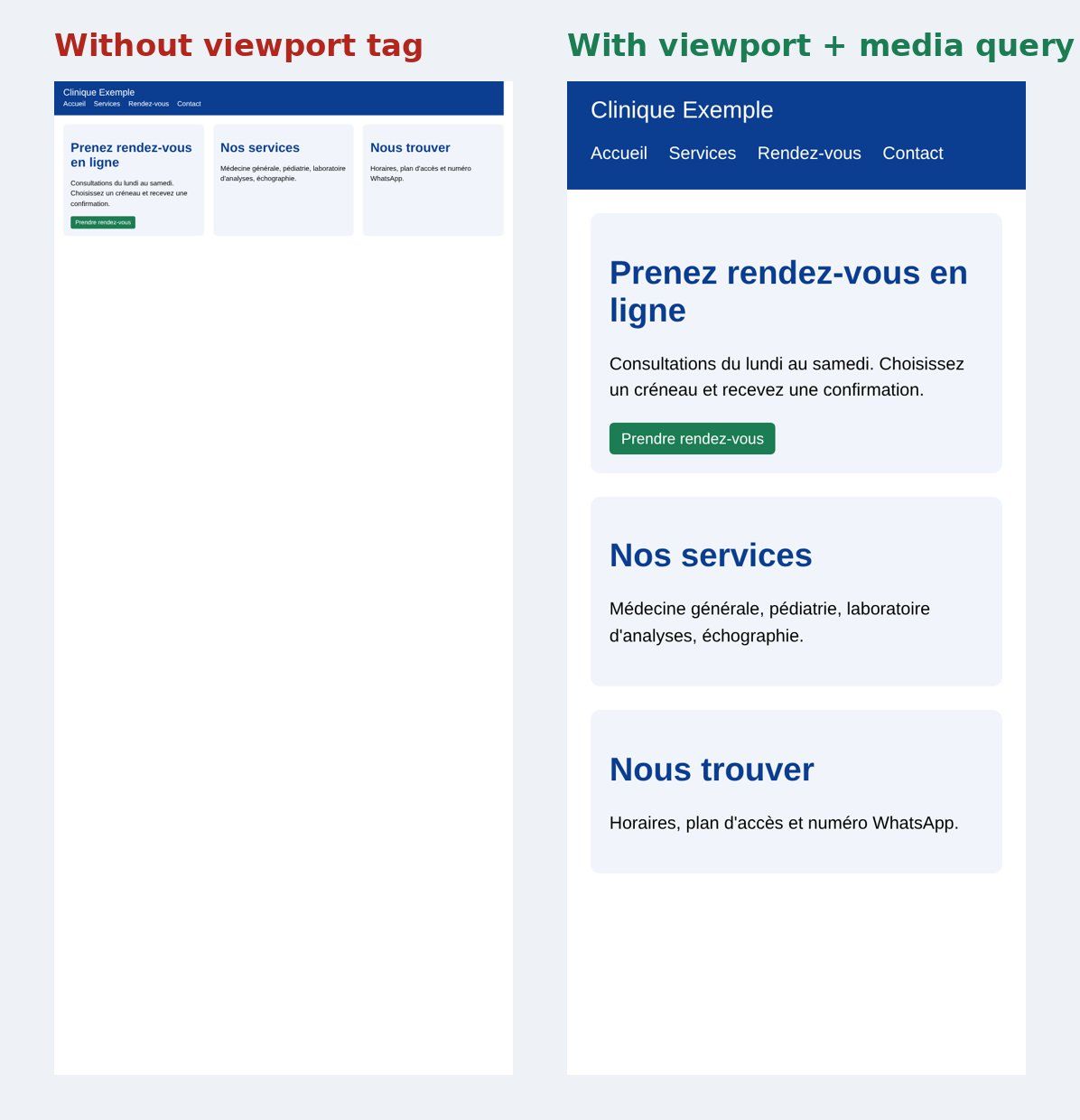
Guelichweb diagram: the same demo page (fictional clinic) without a viewport tag on the left, with a viewport tag and a media query on the right. Captured on a 390 px smartphone simulation, 25 Oct 2026.
Our view: in 2026, "responsive" should no longer be an option you tick in a quote. It is the bare minimum. A site that is not responsive is not "a bit dated"; it is broken for a large share of its audience.
Responsive site, separate mobile site, app: what is the difference?
These ideas are often mixed up. In its mobile-first indexing documentation, Google distinguishes three ways of serving a site on mobile:
- Responsive design: same URL, same HTML, the layout adapts. This is the setup Google recommends, because it is the easiest to implement and maintain.
- Dynamic serving: same URL, but the server sends different code depending on the device. More complex, more room for mistakes.
- Separate URLs: an "m.yoursite.com" site for mobile and another for desktop. You still see these, often poorly synchronised: a page exists on one but not on the other.
A mobile app is something else again: software to download from Google Play or the App Store. It makes sense for frequent use (banking, delivery, order tracking). To present an organisation, its services and its contact details, a responsive website is enough in the vast majority of cases, and it spares your visitors from downloading anything on a limited data plan.
Why it matters even more in French-speaking Africa
According to StatCounter, in September 2026, 60.3% of page views from Benin came from mobile phones, against 38.65% from desktop and about 1% from tablets. Across Africa, mobile reaches 68.69%. But beware of generalising: in Senegal, over the same period, desktop (50.55%) is slightly ahead of mobile (48.38%). These figures measure overall web traffic, not your site's traffic.
Our position is therefore clear: do not decide based on a national average, look at your own audience. A recruitment site browsed from the office does not have the same visitors as a shop page shared on WhatsApp. If you use Google Analytics or a similar tool, the device breakdown is two clicks away.
There are also local realities that guides written elsewhere tend to forget:
- Entry-level and mid-range phones: smaller screens, limited memory, slow processors. A site that runs smoothly on a recent iPhone can crawl on a budget Android.
- Data paid by the megabyte: an uncompressed 4 MB image costs your visitor real money. A well-built responsive site serves lighter images to small screens.
- Patchy connections: 4G is not stable everywhere. A page that takes ten seconds to appear is an abandoned page.
- Traffic from WhatsApp and Facebook: many visitors arrive by tapping a link shared in a conversation. They are on a phone, almost by definition.
What Google really does with sites that are not mobile-friendly
There is a lot of loose talk about a "mobile penalty". Here is what Google itself says. Since October 2023, mobile-first indexing has been rolled out to the whole web: to understand and rank your site, Google looks at the mobile version of your pages, crawled by "Googlebot Smartphone". In June 2024, Google added that after 5 July 2024, sites that are inaccessible on mobile would no longer be indexed at all. What matters is therefore not a responsive "bonus" but a simpler rule: what does not exist or does not work on the mobile version does not exist for Google.
In practice, if your mobile version hides text, images or links that are visible on desktop (to "lighten" the page), that hidden content no longer counts. Google explicitly asks for the same content, the same headings, the same tags and the same image alt text on both versions. To dig deeper into indexing, read our article what is a search engine and how Google crawls and indexes and our guide how to appear on Google.
Let us be honest, though: a perfectly responsive site will not jump to page one by magic. Responsiveness is necessary, not sufficient. Content, speed, your Google Business Profile and links matter just as much.
Google's "Mobile-Friendly Test" no longer exists
Many people still search for "Google mobile-friendly test". Bad news: Google retired it on 1 December 2023, together with the Mobile Usability report in Search Console and the related API, as Search Engine Land reported. If you type the old address, you are sent to other tools. So be wary of tutorials that point you to this tool: they are out of date.
Google now points people to Lighthouse, built into the Chrome browser, and to PageSpeed Insights, which runs Lighthouse and adds real-world usage data when your site has enough traffic. There is no longer a simple "mobile-friendly / not mobile-friendly" verdict. That is more honest, but you need to know where to look. That is what the method below is for.
How to check whether your website works on mobile: a 5-step method
This is the routine we follow at the start of an audit. Steps 1, 4 and 5 need no technical skills, and steps 2 and 3 need ten minutes of curiosity. Allow about a quarter of an hour in total.
Step 1: a real phone, the most important test
Take the most ordinary phone in your team, not the newest one. Turn off Wi-Fi so you are on mobile data. Open your site the way a customer would: by typing its name into Google, or by tapping the link from WhatsApp. Then try to do what the site exists for: find a price, book an appointment, call, download a form, make a donation. If you struggle, so do your visitors. Then repeat on a second browser; our article on web browsers explains why a site can look different from one browser to another.
Step 2: Chrome's device mode, to test several screen sizes
On a computer, open your site in Google Chrome, right-click and choose "Inspect" (or press F12), then click the phone-and-tablet icon at the top left of the panel. You can pick a device model or drag the viewport width from 320 to 1,440 pixels and watch the page rearrange itself. The official documentation offers reference widths: 320, 375 and 425 pixels for phones, 768 for tablets.
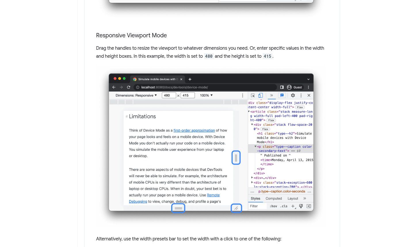
Source: developer.chrome.com, "Simulate mobile devices with device mode" documentation, captured 25 Oct 2026.
Important: Google itself says this mode is only a first-order approximation. It simulates the screen size, not the phone's processing power or the network quality. It never replaces step 1. "Online responsive test" sites that display your page in several frames have the same limitation, plus the risk that some sites refuse to load inside a frame.
Step 3: Lighthouse and PageSpeed Insights, for mobile speed
Go to PageSpeed Insights, paste the address of your home page and run the analysis. Stay on the "Mobile" tab, which is the one Google uses for indexing. If your site has enough visitors, the first part shows real data (how the page actually loads for your visitors); the second is a Lighthouse diagnosis simulated on a mid-range phone with a throttled connection. The same audit is available in Chrome, under the "Lighthouse" tab of the developer tools.
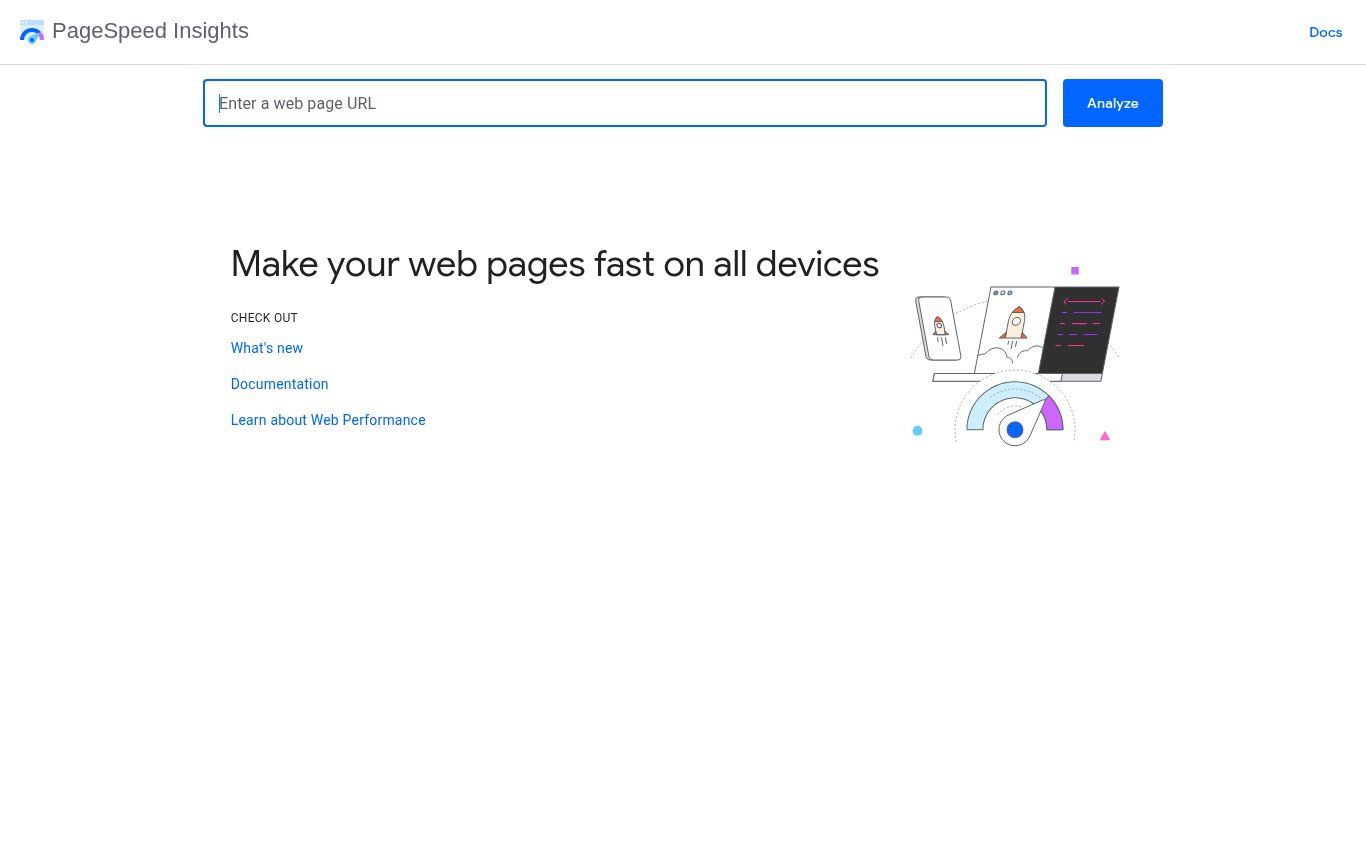
Source: pagespeed.web.dev, PageSpeed Insights home page, captured 25 Oct 2026.
Do not obsess over the score out of 100: it varies from one run to the next. Look instead at the top recommendations (oversized images, render-blocking scripts, fonts) and any warnings about content width or tap targets. A responsive but slow site is still a bad mobile site.
Step 4: Search Console, to see your page as Google does
If your site is connected to Google Search Console, use the URL Inspection tool. It tells you whether the page is indexed and lets you "Test live URL" and then view a screenshot of the page as Googlebot Smartphone sees it. If the screenshot is blank, cut off or different from what you expect, you have found a problem your visitors would never have reported.
Step 5: the checklist
During steps 1 and 2, go through these points. Every "no" is a fix to plan.
- No horizontal scrolling: the page should never slide sideways. The WCAG 2.2 accessibility guidelines require content to remain usable at a width of 320 pixels without scrolling in two directions.
- Text readable without zooming: if you need to pinch to read a paragraph, it has failed.
- Buttons and links easy to tap: big enough and far enough apart for a thumb. WCAG 2.2 sets a minimum of 24 × 24 pixels; in practice, we aim well above that for main buttons.
- A usable menu: it opens, it closes, and every important page is listed.
- Clickable phone number and WhatsApp: tapping the number should start a call, tapping the WhatsApp button should open the chat.
- Easy-to-fill forms: wide enough fields, the right keyboard (numeric for a phone number), visible error messages.
- Images that fit the screen and do not weigh several megabytes.
- Readable tables and price grids: a six-column table does not fit on a phone; it must reflow or scroll neatly inside its own box.
- No pop-up covering everything that you cannot manage to close.
- Accessible documents: if your forms or brochures are PDFs, check they open and read properly on a phone, or put the information directly on the page.
Responsive website examples
The "responsive website examples" lists you find online often showcase spectacular creative-agency sites. They look great, but they look nothing like a clinic, school or town-hall website. Here is what we look for in a useful example instead.
The first example we can show without inventing anything is our own site. Below, the same guelichweb.online home page displayed on a 1,366-pixel-wide desktop screen and on a 390-pixel smartphone: same content, same address, but the menu folds away, the blocks stack and the call-to-action button stays visible.

Source: guelichweb.online/en, captured 25 Oct 2026 at 1,366 px (desktop) and 390 px (smartphone).
Depending on the type of organisation, this is what a good responsive site must get right on a phone:
- An SME or shop: the product, the price or "on quote", and a WhatsApp or call button visible on the very first screen.
- A clinic or practice: opening hours, address with a Google Maps link, a tappable emergency number, booking in a few taps.
- A school or training centre: fees, calendar and enrolment requirements readable without downloading an unreadable PDF.
- An NGO: the mission in one sentence, the projects, a donation or contact button that works with local payment methods.
- An institution or town hall: the most requested procedures one tap away, and an internal search that works with a thumb.
If you are planning a new site, write these expectations into your website requirements document, along with the list of devices the site will be tested on before delivery.
Your site is not responsive: what now?
It depends on how it was built.
- WordPress site: most recent themes are responsive. The problem usually comes from an old theme, a badly configured page builder or content added with fixed widths. Switching themes is sometimes possible but means checking every page. Our article what is WordPress and when to choose it helps you decide.
- Wix, Squarespace or another site builder: the mobile version is often generated automatically and can then be adjusted in the editor. Check it page by page: an element moved on desktop can end up misplaced on mobile. More in our comparison Wix, Squarespace or a custom website.
- Hand-coded or old custom site: at the very least, add the viewport tag, then rework the stylesheet with media queries. On a very old site, a redesign often costs less and lasts longer than a series of patches.
- AI-generated site: recent tools generally produce a responsive layout, but still test forms, menus and tables. See our analysis AI website builder vs professional website.
Once fixed, responsiveness has to be watched over time: every new page, every banner added by a colleague can break the mobile layout. That is one reason we include a mobile check in website maintenance. And if your site is technically sound but still brings in no enquiries, the problem may lie elsewhere: read why your website is not bringing customers.
As for the cost of a fix or a redesign, we do not quote blind: it depends on the number of pages, the platform and the state of the code. We prepare a quote after a diagnosis; you can browse our offers and our guide on what a website quote in Benin should include.
Frequently asked questions about responsive websites
What is a responsive website, in one sentence?
It is a website whose layout automatically adapts to the screen size (desktop, tablet, smartphone), with the same content and the same address on every device.
How can I tell in one minute whether my site is responsive?
Open it on your phone. If you need to zoom to read, if the page slides sideways or if the buttons are too small for your thumb, it is not responsive, or poorly so. To confirm on a computer, narrow the Chrome window or use device mode (F12).
Is there still an official Google mobile-friendly test?
No. Google's Mobile-Friendly Test was retired on 1 December 2023. Use Lighthouse in Chrome, PageSpeed Insights (Mobile tab) and Search Console's URL Inspection instead.
Is a responsive site automatically fast?
No. Responsiveness is about layout; speed depends on image weight, hosting and code. A site can display correctly on mobile and still take ten seconds to load. Both need checking. Our article on web hosting in West Africa covers part of the question.
Do I need a mobile app as well as a responsive site?
Rarely, at least to start with. An app makes sense if your users come back very often and need specific features. To get known and be contacted, a responsive website is enough.
What does "mobile first" mean?
Two related things. In design, "mobile first" means designing the phone version first, then enhancing it for larger screens. For Google, "mobile-first indexing" means Google analyses the mobile version of your pages to rank them.
Our final take
A responsive website is not a selling point, it is the foundation. The real question is not "is my site responsive?" but "can a visitor on an ordinary phone, with an average connection, do what I expect of them in under a minute?". Run the real-phone test today. It is free, it takes five minutes, and it will tell you more than any score out of 100.
Want an outside view? Send us your site's address through our contact page. We start with a diagnosis of mobile display and speed, then propose the simplest fix, or a redesign if it is genuinely needed. You can also explore our services and our website design in Cotonou offer.