Website accessibility: legal requirements (Benin, Africa, Europe), a free 30-minute test and the fixes that matter most (WCAG 2.2)
G. CHRIST
Published on November 12, 2026
Try something simple. Put your mouse aside, open your website and try to send the contact form using only the Tab key. Then open the same site on a phone, outdoors, at noon, in full sunlight. If you can’t finish one of these two tests, some of your visitors can’t either. And they won’t tell you. They’ll just leave.
That is what website accessibility means: a site that everyone can use, including people who have poor eyesight or hearing, can’t use a mouse, struggle with reading, or rely on a screen reader. The subject has a reputation for being something only European governments and large corporations need to care about. We think that’s a mistake, especially in French-speaking Africa, where people browse on entry-level phones, over patchy connections, sometimes on cracked screens.
In this guide we keep it jargon-free: what the standard actually says (WCAG 2.2), what is and isn’t mandatory in Benin, across West Africa and in Europe, a free 30-minute test you can run yourself, and the fixes that solve the vast majority of problems.
The short version
- An accessible site works with a keyboard, can be read by a screen reader, keeps enough colour contrast, describes its images and labels its form fields.
- The global reference is WCAG 2.2, level AA, published by the W3C and now also the international standard ISO/IEC 40500:2025.
- Benin has no law setting technical rules for websites, but Law No. 2017-06 requires public and private communication services to take people with disabilities into account.
- In Europe, the European Accessibility Act has applied since 28 June 2025 to consumer e-commerce, with an exemption for service microenterprises.
- Six error types account for 96% of the automatically detected problems on the world’s million most visited home pages, and you can fix them without rebuilding your site.
- “One-click accessibility” widgets do not make a site compliant. We advise against them.
What web accessibility really means
The W3C, the body that sets web standards, puts it this way: websites should be designed so that people with disabilities can perceive, understand, navigate and interact with them (W3C introduction). The audience is far bigger than most people assume. According to the World Health Organization, about 1.3 billion people live with a significant disability, which is 16% of the world’s population.
Then add everyone with a temporary or situational limitation: a 65-year-old parent whose eyesight is fading, a shopkeeper browsing your catalogue with one hand, a student reading in direct sunlight, someone with an arm in a cast, someone whose connection won’t load images. Designing for the first group nearly always helps the second.
In practice, an accessible site follows a handful of plain rules:
- Perceivable: text is readable (contrast, size), images have alternative text, videos have captions.
- Operable: everything works from a keyboard, buttons are big enough for a finger, nothing flashes or moves without control.
- Understandable: the page language is declared, error messages explain what to fix, navigation stays consistent from page to page.
- Robust: the code is clean and readable by assistive technologies (screen readers, magnifiers, voice control).
We didn’t make those four words up: they are the four WCAG principles. If you want the technical basics (tags, headings, field labels), our article What is HTML? covers them.
WCAG 2.2: the standard you need to know, in plain English
The Web Content Accessibility Guidelines (WCAG) 2.2 have three levels: A (the minimum), AA (the level almost every law and policy asks for) and AAA (very demanding, rarely required for an entire site). In September 2025 the W3C announced that WCAG 2.2 had been approved as the international standard ISO/IEC 40500:2025. In other words, it is no longer just expert advice.
Our advice is simple: aim for WCAG 2.2 level AA. A site that meets 2.2 also meets 2.1 and 2.0, so if a partner still talks about 2.1, you’re covered.
What version 2.2 added that genuinely helps your visitors:
- Target size: a button or link should be at least 24 × 24 CSS pixels, or be spaced far enough from its neighbours. This is the rule that saves your mobile users.
- Focus not obscured: when someone navigates by keyboard, the active element must not disappear under a sticky header or a cookie banner.
- Accessible authentication: logging in must not depend on a cognitive test (copying an unreadable code, solving a puzzle) with no alternative. Copy-paste and password managers must work.
- Consistent help: if you offer a help link, a phone number or a WhatsApp button, put it in the same place on every page.
- Redundant entry: don’t ask again for information already given in the same process (retyping a delivery address at the next step, for example).
Is it mandatory? Benin, West Africa, Europe
Let’s be precise, because many pages blur everything together.
In Benin
We found no Beninese text that imposes technical accessibility rules on websites: no reference framework, no mandatory accessibility statement. However, Law No. 2017-06 of 29 September 2017 on the protection and promotion of the rights of persons with disabilities sets a clear principle. Article 62 states that public and private communication services, the print press and broadcasters must take people with disabilities into account when delivering their services. Benin also ratified the UN Convention on the Rights of Persons with Disabilities in 2012, whose Article 9 covers access to information technologies.
In practical terms: for a ministry, a town hall, a public body or any online service aimed at citizens, “it’s not mandatory” is a weak argument. For a small business, it isn’t a precise legal requirement today, but it is a customer question.
Elsewhere in the region
Senegal has its Social Orientation Law No. 2010-15 on the rights of persons with disabilities, which includes access to technology, but according to the analyses we reviewed there is still no dedicated web accessibility law. In Côte d’Ivoire, Law No. 2024-352 on electronic communications contains measures for inclusive access for persons with disabilities. Some Senegalese public platforms already state a WCAG 2.1 AA target. The direction of travel is clear, even if implementing decrees and enforcement are still missing.
In Europe
If you sell online to consumers in the European Union (diaspora customers, crafts, training, tourism), the European Accessibility Act has applied to e-commerce services since 28 June 2025. Service microenterprises are exempt (fewer than 10 people and annual turnover or balance sheet of no more than €2 million). In France, the RGAA, a framework based on WCAG, applies to public bodies and to private companies with turnover above €250 million (official scope, in French).
For an NGO or an institution funded by international partners, the question is different: inclusion of people with disabilities is often part of the project’s commitments. A website those people cannot use contradicts what you write in your reports. We cover this in our guide to what an NGO website should include.
Why bother even when nobody forces you
Our position: accessibility is not a compliance checkbox, it’s build quality. An accessible site is almost always a better-built site. The concrete benefits:
- More completed enquiries. A form with clearly labelled fields and clear error messages gets filled in more easily, by everyone.
- Better SEO. Ordered headings, alternative text, descriptive links: Google reads your page a bit like a screen reader does. The two efforts overlap a lot.
- A more readable mobile site. Contrast, button size, zoom allowed: exactly what small screens lack. See our article on responsive websites.
- A credible image. For an institution, a site that part of the public can’t use is a public-service problem, not a design detail.
The free 30-minute test (no developer needed)
No tool can certify on its own that a site is accessible; the W3C says so in its evaluation guidance. But this test catches the essentials. Run it on three pages: the home page, a service or product page, and the contact page.
- Keyboard (5 min). Unplug the mouse. Using Tab, Shift + Tab and Enter, open the menu, reach every link, fill in and send the form. Can you always see where you are (a visible outline)? Do you get stuck inside a pop-up?
- Zoom (3 min). On a computer, zoom to 200%. Text should stay readable without horizontal scrolling. On a phone, try pinching to zoom: if it’s blocked, that’s a defect.
- WAVE (7 min). Paste the page address into WAVE, WebAIM’s free tool, or install its Chrome, Firefox or Edge extension. Look at errors (in red) and contrast errors first.
- Contrast (3 min). Check your main colour pairs (text on background, button text) in WebAIM’s Contrast Checker. You need at least 4.5:1 for normal text, and 3:1 for large text and button borders.
- Screen reader (7 min). On Android, turn on TalkBack (Settings, Accessibility). On iPhone, VoiceOver. On Windows, NVDA is free. Listen to your contact page: are buttons announced by name, or just “button, button”?
- Images, videos, documents (5 min). Do important images have a description? Do videos have captions? Can you select the text in your PDFs? If not, they are scanned images that a screen reader can’t read.
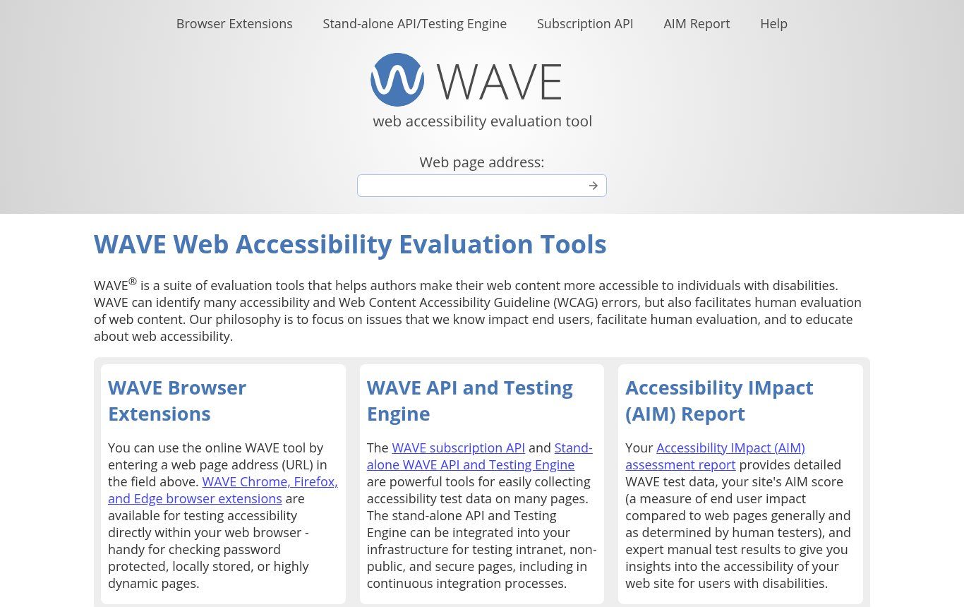
Source: wave.webaim.org, captured 12/11/2026. Tool mentioned as an example, no commercial relationship.
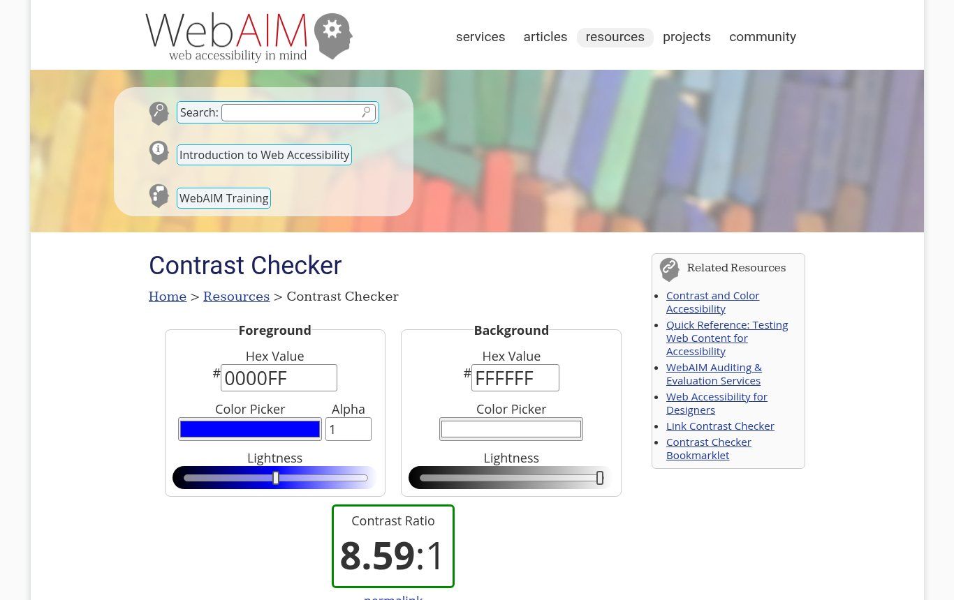
Source: webaim.org/resources/contrastchecker, captured 12/11/2026. Example: pure blue on white, ratio 8.59:1, well above the 4.5:1 minimum.
You can add the Lighthouse audit built into Chrome’s developer tools. Be careful with its score: Google itself says it only reflects automated checks (Lighthouse documentation). A score of 100 does not mean “accessible”. For a wider check of your site (speed, SEO, security), our free website audit checklist takes over.
The 6 errors behind 96% of problems
Every year WebAIM analyses the home pages of the top one million websites. The 2026 report is harsh: 95.9% of pages had detectable WCAG failures, with an average of 56.1 errors per page, up from 2025. But one finding should reassure you: 96% of detected errors fall into six categories, the same six for seven years. Here they are, with the fix.
1. Low-contrast text (83.9% of pages)
Light grey on white, white on pale orange, text placed over a photo. The fix belongs in your brand rules: set a text colour and a button colour that pass the test, then stick to them. If your brand guidelines have never been tested, now is the time.
2. Images without alternative text (53.1%)
Alternative text (the alt attribute) describes the image for people who can’t see it. A good rule: describe the information, not the look. “Photo” or “image1.jpg” is useless. A purely decorative image gets an empty alt so it is skipped. A clickable image (a logo linking to the home page) should say where it goes.
3. Form fields without labels (51%)
The grey hint inside a field (“Your name”) vanishes as soon as you type and isn’t always read aloud. Every field needs a visible label tied to it. We explain the right structure in our contact form guide.
4. Empty links (46.3%)
Typically the Facebook, WhatsApp or LinkedIn icons in the footer, with no text at all. A screen reader says “link” and nothing else. Give them an accessible name, such as “Guelichweb on WhatsApp”. Same logic for “click here” or “read more”: prefer “See our website packages”.
5. Empty buttons (30.6%)
The magnifying-glass search button, the hamburger button of the mobile menu, the close cross: without a name, they are silent. Same fix: a label, visible or not.
6. Missing page language (13.5%)
One line of code (lang="en" or lang="fr") tells the screen reader which voice to use. Without it, your French text may be read with English pronunciation and become incomprehensible. If a page contains a passage in another language, English or a national language, you can mark that passage too.
What most guides miss (and what is common in French-speaking Africa)
European guides talk about compliance frameworks and government websites. Here are problems that are very common on business, NGO and institutional websites in the region, and that those guides almost never mention.
- Notices and announcements as scanned PDFs. Job postings, tenders, decrees: published as photos of paper, they can’t be read by a screen reader, can’t be zoomed properly on a phone and are invisible to Google. Publish the text on the page, with the PDF as an extra.
- The floating WhatsApp button. On mobile it often covers the form’s submit button or the content, and it has no name. Place it where it doesn’t get in the way, and name it.
- Timed Mobile Money payments. A code to enter within a few minutes, with no warning and no way to extend, puts slow readers and screen-reader users in trouble. Announce the time limit and make it easy to start again. If you are building a shop, keep this in mind from day one (creating an online store in Benin).
- Videos without captions. Many visitors watch with the sound off, on a bus or in a shared office. Captions serve deaf people and everyone else. Audio transcription tools save a lot of time.
- Heavy pages. Not a WCAG criterion in the strict sense, but an 8 MB page that won’t load on 3G excludes people as surely as poor contrast. See website speed.
- Auto-playing carousels. They move too fast to read and are hard to control by keyboard. If you keep one, add a pause button.
WordPress, Wix and site builders: what changes
The tool guarantees nothing either way. In the 2026 WebAIM report, home pages built with WordPress had 52.8 errors on average, against 33.3 for Wix and 33.0 for Squarespace. That is an average across very different sites, not a verdict: a well-chosen WordPress theme with carefully entered content gives an excellent result.
On WordPress, three habits:
- Pick a theme tagged accessibility-ready in the official directory, which signals it passed a basic accessibility review.
- Fill in the “Alternative text” field in the media library for every image, and train whoever publishes content. That is often where things go wrong.
- Be wary of page builders that stack blocks: they produce decorative headings in the wrong order and unnamed buttons.
If you’re still unsure about the tool, our article What is WordPress and when to choose it will help you decide.
“One-click accessibility” widgets: our view
You have probably seen those small blue icons that promise to make a site compliant by adding one line of code. We advise against them. They don’t fix the underlying code, they often add barriers of their own, and screen-reader users already have their own settings.
Regulators are starting to say so too. In the United States, the Federal Trade Commission ordered the vendor accessiBe to pay $1 million for claiming its tool could make any website WCAG-compliant (TechCrunch; order proposed in January 2025, finalised in April 2025). The budget for that kind of subscription is better spent fixing the six errors above.
Publishing an “Accessibility” page: simple and useful
Even without an obligation, a short “Accessibility” page reassures visitors and helps them. It states the target level (WCAG 2.2 AA), what has been done, what hasn’t yet, and above all how to report a problem and get the information another way (phone, email, WhatsApp). The W3C offers a free accessibility statement generator so you don’t start from scratch.
One rule: never write “100% accessible website” unless it has been checked. An honest statement beats a false promise.
Where to start, depending on your organisation
Small businesses, shops, professional firms
Run the 30-minute test, then fix contrast, form labels, social media icons and the page language. These are targeted fixes on your existing site, not a redesign. The rest can wait for the next update.
NGOs and funded projects
Add captions to your videos, publish reports as readable text (not scans) and add an “Accessibility” page with a contact. If your target audience includes people with disabilities, test with them: nothing replaces ten minutes with a real screen-reader user.
Institutions and public services
Aim for WCAG 2.2 AA and write it into the requirements document of any new site or redesign, with a check before going live. Plan for content too: the best templates are useless if notices keep being published as scanned PDFs.
Do it yourself or get help?
Many fixes are within your reach: alternative text, link wording, captions, documents as text. Others touch the theme or the code: visible focus, keyboard menus, pop-ups, complex forms. For those you need someone who can change the template without breaking everything else, plus regular checks, because every new page can bring errors back. That is what maintenance is for.
At Guelichweb we build these rules into the sites we create, and we can audit an existing site. We don’t publish a standard price: the work depends on the tool, the number of templates and the state of the content. We start with a diagnosis, then a quote. You can browse our packages and services.
Frequently asked questions
What is an accessible website?
A site that everyone can use, including people with visual, hearing, motor or cognitive disabilities: it works with a keyboard, can be read by a screen reader, has enough contrast, describes its images and has understandable forms.
Is website accessibility mandatory in Benin?
No Beninese text currently sets technical rules for websites. Law No. 2017-06 does, however, require public and private communication services to take people with disabilities into account. For public online services, that is a strong reason to align with WCAG 2.2 AA.
How can I test my website’s accessibility for free?
Combine a keyboard test, 200% zoom, the WAVE tool, a contrast checker and five minutes with TalkBack, VoiceOver or NVDA. Automated tools only find part of the problems, so manual testing is essential.
What is the difference between WCAG and RGAA?
WCAG is the W3C’s international standard. RGAA is the French framework built on WCAG, which specifies how to check each criterion for the organisations covered in France.
Can a plugin make my site accessible?
No. Some plugins help (contrast checks, alt-text reminders), but none replaces fixing the theme and the content. Be wary of any promise of automatic compliance.
Does accessibility improve SEO?
Indirectly, yes. Ordered headings, alternative text, descriptive links and a fast site serve both screen readers and search engines. It isn’t a magic ranking factor; it’s a better-built site.
Do I need to rebuild my whole site?
Rarely. Most problems can be fixed on the existing site. A redesign makes sense if the theme is too old to fix or if the site needs modernising anyway.
Our conclusion
Website accessibility is neither a luxury for European administrations nor an endless project. It is a set of well-known rules, and six of them solve most of the problem. The test takes 30 minutes, the first fixes don’t require rebuilding your site, and everyone benefits: visitors with disabilities, busy visitors on mobile, and your search rankings.
Want to know where your site stands, or build accessibility into a new project? Contact Guelichweb: we’ll look at your site and tell you what’s blocking people and what can wait.