Website contact form: examples, useful fields and how to create one for free (without losing messages)
G. CHRIST
Published on October 31, 2026

A contact form looks like the most boring part of a website. Three boxes, one button, done. Yet when we audit a company or NGO website, it is one of the first places where we find lost money: messages landing in spam, a receiving address nobody checks anymore, a phone field that rejects 10-digit numbers, or a form that proudly shows "Thank you!" without sending anything at all.
The trouble is that these failures are silent. A customer who never gets an answer does not write a second time to warn you. They call your competitor.
At Guelichweb we build websites and automations for SMEs, NGOs and institutions in Benin and across French-speaking Africa. This guide gathers what we apply on our own projects: which fields to keep (and which to delete), a concrete example, the free tools with their real limits, and above all the part most tutorials skip: what happens after someone clicks "Send".
What a contact form is really for
A contact form is an area of your website where a visitor fills in a few fields (name, how to reach them, message) to write to you without leaving the page or opening their email app. The message then reaches you by email, in a spreadsheet, in a CRM or on WhatsApp, depending on how it is wired.
You might think an email address and a WhatsApp number are enough. They are essential, but they do not replace a form, for three reasons:
- It structures the request. Instead of "Hello, how much?", you receive the need, the deadline and the city. You can give a useful answer in the very first reply.
- It leaves a trace. Every request can be saved automatically, dated and assigned to someone. A WhatsApp voice note heard between two meetings is easily forgotten.
- It reassures some audiences. A donor, a procurement department or a public body often prefers a formal channel to a salesperson's personal WhatsApp.
Our position is simple: on a business website in West Africa you need both. A short form for requests that deserve a record, and a visible WhatsApp button for people who want an answer right now. Pitting one against the other is a waste of time.
Fields to keep, and fields to delete
Every field you add has a cost: typing time on a small phone, one more chance of error, and one more piece of personal data to protect. The test we apply before keeping a field fits in one sentence: "When someone fills this in, what do I do differently?" If the answer is "nothing in particular", the field goes.
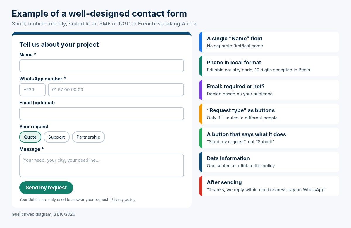
Guelichweb diagram, 31/10/2026: a short contact form suited to an SME or an NGO.
Fields that earn their place
- Name: a single field. Splitting first and last name causes trouble with many compound names or different name orders, and adds nothing to your reply.
- Phone (WhatsApp): in our markets this is often the most useful field, more than email. Say so in the label: "WhatsApp number". More on the format below.
- Email: required for a company working with institutional clients, optional for a neighbourhood business. Decide, instead of making everything required by reflex.
- Message: a real text area, tall enough to show several lines, with a hint of what you expect ("Your need, your city, your deadline").
- Request type: only if it routes the message to different people (quote, after-sales, partnership, press). Three or four options at most, shown as buttons rather than a dropdown.
Fields we almost always remove
- "Subject": people write it in the message anyway.
- "How did you hear about us?": useful for you, tedious for the visitor. Ask in your reply, or measure it with your analytics (see our Google Analytics 4 guide).
- Full postal address, date of birth, ID number: unless the law requires it, you do not need them to answer a first message. Collecting less also means having less to protect.
- File uploads: only when essential (photos for a repair quote, a project brief). They raise questions of size, storage and security.
What makes a form pleasant to fill in
Most forms we fix do not have a design problem. They have a clarity problem. These are the rules that make the biggest difference, largely drawn from the W3C forms tutorial, the reference on accessibility:
- A visible label above every field. The grey text inside the box (the "placeholder") vanishes as soon as you type and is hard to read in sunlight. It is not a label.
- The right keyboard on mobile. An email field should be of type email and a phone field of type tel, so the phone shows the matching keyboard. This small detail cuts typing mistakes a lot.
- Plain-language errors next to the field. "Enter a 10-digit number, for example 01 97 00 00 00" rather than "Invalid input". And without wiping what the person already typed.
- A button that says what it does. "Send my request" or "Get my quote" rather than a bare "Submit".
- A confirmation that makes a promise. After sending, say when and how you will reply: "Thanks, we will answer within one business day on WhatsApp." Then keep that promise.
On placement: the form belongs on a real Contact page reachable from the menu, and repeated at the bottom of pages that sell (services, offers). On a campaign page it can even be the page's only goal; that is the idea behind a landing page.
The African detail many templates miss: the phone number
Almost all form templates you find online are designed for Europe or North America. The result: a phone field that demands a French or US format, or limits input to 8 digits.
In Benin, however, the telecom regulator ARCEP moved numbers from 8 to 10 digits on 30 November 2024: you add the prefix 01 in front of the old number, and +229 01 from abroad. We still see websites that reject 10-digit numbers, or contact pages showing the old number. If your audience is regional (Côte d'Ivoire, Senegal, Togo, Cameroon, the diaspora), number lengths vary from one country to another.
Our default settings:
- a "Country code" field prefilled with +229 (or your main market's code), and editable;
- a number field that accepts spaces and dashes, without an overly strict length rule;
- automatic server-side clean-up that stores the number in international format (for example 22901…), the format WhatsApp needs.
That last point is not cosmetic: it is what lets you open the WhatsApp conversation in one click from your inbox instead of copying the number by hand.
Example: the HTML code of a simple contact form
For those who touch a bit of code, here is the basic structure. If the tags mean nothing to you, our article What is HTML? is enough to follow along; the reference documentation is MDN's "Your first form" guide.
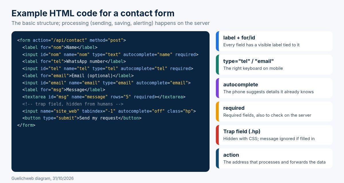
Guelichweb diagram, 31/10/2026: HTML structure of an accessible contact form.
This code is not enough on its own. An HTML page cannot send an email: it needs a processing address (the action attribute) that receives the data and does something with it. That is where you choose between an external service, a plugin for your CMS, or processing on your own server.
How to create a free contact form: the real options
Good news: you can have a reliable form without paying anything at the start. Bad news: every free option has a limit you had better know before the day it blocks you. Here are the ones we meet most often, checked on their official pages on 31/10/2026.
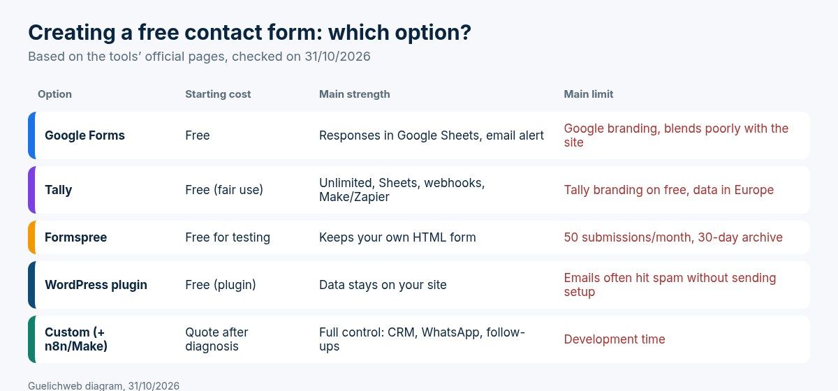
Guelichweb diagram, 31/10/2026, based on the tools' official pages.
Google Forms: the simplest, but a form "next to" your site
Google Forms is free with a Google account, responses can be saved to a Google Sheets spreadsheet, and you can turn on an email notification for each new response. For a workshop registration, an NGO call for applications or a survey, it is great. For a company's Contact page we avoid it: the form shows Google's branding, blends poorly with your design and takes the visitor out of your world.
Tally: very generous for free
Tally advertises unlimited forms and responses for free (within fair use), with email notifications, Google Sheets export, webhooks and connections to Make or Zapier. It is one of the best no-code options today. Limits to know: the Tally branding stays visible on the free plan, and your data is hosted by a European provider, which should appear in the information you give visitors.
Formspree and other "serverless" form services
For a hand-coded or static site, services like Formspree receive the data from your own HTML form and forward it to you by email. The free plan is presented as being for testing: 50 submissions a month and a 30-day archive, with no automatic reply to the visitor. Enough to start, too tight as soon as a campaign works.
WordPress plugin
If your site runs on WordPress, a free form plugin does the job and keeps the data on your side. The classic trap: WordPress sends emails from your hosting without a proper sending setup, and many of them end up in spam or never arrive. It is the number one reason people search "WordPress contact form not working".
Custom form
This is what we do on most of our sites: a form built into the design, server-side processing, bot protection and a connection to the team's tools. It takes development time, but it is the only option where you control everything: where the data goes, who gets notified, what happens next.
After the click: where most requests get lost
Here is the strongest opinion in this guide: a form that only sends an email to contact@ is not a contact system, it is a bet. A bet that the right person will read the right email at the right time, that it will not be filtered as spam, and that someone will remember to reply.
In the SMEs and NGOs we work with, the same scene comes up often: a "contact" mailbox created when the site launched, tied to a former employee or to a phone nobody opens. Requests pile up there for months. That is not a website problem, it is a workflow problem.
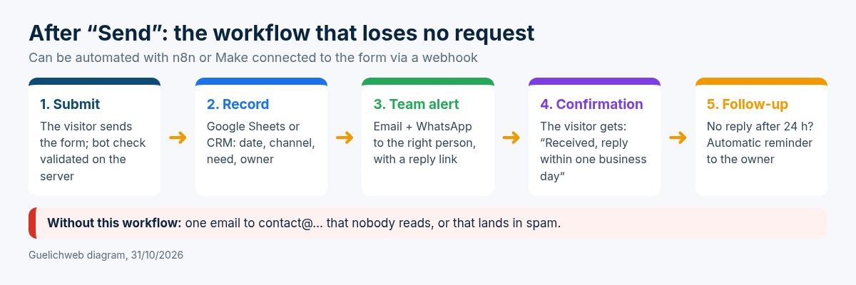
Guelichweb diagram, 31/10/2026: a request workflow that lets nothing slip.
The workflow we set up, to adapt to the size of the team:
- Save every request somewhere shared: a Google Sheet at minimum, a CRM as soon as you have salespeople. Email becomes a copy, no longer the only record.
- Alert the right person where they actually look. For many teams in Benin that is WhatsApp. An alert such as "New quote request, Cotonou, e-commerce site" with a link to reply saves hours.
- Confirm to the visitor that the request arrived, with the promised delay. An automatic email, or a WhatsApp message if you use the WhatsApp Business API, which requires the person's prior consent.
- Follow up internally if nothing has moved after one business day. It is the step nobody does by hand, and the most profitable one.
All of this can be automated without heavy development, using a tool like n8n or Make connected to your form through a webhook. If you are torn between the two, read our n8n or Make comparison. And if the request is mostly about booking a slot, a real booking tool fits better than a form: see our guide to online appointment booking.
Staying out of spam
If notifications are sent from your domain, they must go through a properly configured sending service (SPF, DKIM and DMARC records), as required by Gmail's email sender guidelines. Receiving requests on a professional email address tied to your domain name, rather than a personal address, also keeps the history when someone leaves the team.
Form or WhatsApp button: do you have to choose?
No. But you need to know what each one does well.
- The WhatsApp button (a wa.me link, described in WhatsApp's official help) opens a chat with your number straight away, optionally with a prefilled message. Perfect for quick questions, orders and mobile visitors.
- The form structures, records and routes the request. Perfect for quotes, partnerships, applications and anything that needs follow-up.
The mistake we see: replacing the form with a single WhatsApp button tied to the manager's phone. It works until the day they travel, change number or get a hundred messages a day. Beyond a certain volume, a well-designed WhatsApp chatbot can ask the same questions as the form and pass the request to the team.
Spam and bots: protect the form without scaring real visitors away
As soon as a form is online, bots find it. Without protection you will get dozens of fake messages and your real requests will drown. What we combine:
- An invisible trap field (a "honeypot"): hidden from humans, bots fill it in and the message is discarded. Free and painless for the visitor.
- A discreet bot check such as Cloudflare Turnstile, which is free and usually avoids picture puzzles. Careful: its own documentation states that server-side validation is mandatory, otherwise the protection is not real.
- A rate limit per IP address over a short period, and filtering of messages that contain nothing but links.
What we avoid: picture CAPTCHAs full of traffic lights, painful on a small screen with a slow connection. You block the bots, but also part of your customers.
Personal data: what to show next to the form
A form collects personal data: a name, a number, sometimes an email. In Benin the framework is set by Law No. 2017-20 on the Digital Code, enforced by the personal data protection authority (APDP). Among the obligations the APDP highlights in its practical guides: informing people at the time of collection (who collects, why, and their rights) and ensuring the confidentiality and security of the data. The APDP provides a model privacy policy and other compliance tools. Other countries follow the same logic; in Europe it is the GDPR.
In practice, below the button we add a short sentence such as: "Your details are only used to answer your request. They are never sold or shared. See our privacy policy." With a link to the real page. If you also want to send a newsletter, add a separate checkbox, unticked by default. This is not legal advice: for sensitive processing (health, minors, large volumes), have your setup checked by a lawyer or directly with the APDP.
Finally, if the form loads third-party services (bot check, map, analytics), this also affects your cookie banner; our article on cookies and trackers explains what it should contain.
Before going live: our 10-minute test
We never hand over a form without this test. Run it on your current site too: it is free and you might be surprised.
- Send a message from a phone, on 3G if possible, not only from the office.
- Enter a 10-digit Beninese number, then a foreign number. Both must go through.
- Leave a field empty on purpose: is the error message clear, and is everything else you typed still there?
- Check that the notification arrives, in the inbox and not in spam, for the person who must reply.
- Check that the request is saved in the spreadsheet or CRM.
- Check the confirmation the visitor receives: promised delay, right name, no typos.
- Repeat once a month. Forms often break after an update, a hosting change or an email password change.
If you get few online requests even though your site has visitors, the form may not be the only culprit; our article why your website is not bringing customers reviews the other common causes. For an NGO, the contact page also plays a transparency role with donors: see what an NGO website should include.
Contact form FAQ
Which fields should a contact form have?
For a first contact: name, a way to reply (WhatsApp number and/or email) and the message. Add a "request type" only if it routes the message to different people. Everything else can be asked during the conversation.
How do I create a free contact form?
With Google Forms or Tally without coding, with a service like Formspree for an HTML site, or with a free plugin if your site runs on WordPress. Check the free plan's submission limit, whether the tool's branding shows, and where the data is stored.
Why am I not receiving messages from my form?
The most common causes: emails are sent without a proper sending setup and land in spam, the receiving address is old or mistyped, the bot protection also blocks humans, or an update broke the plugin. Send a test and check the spam folder first.
Does a contact form need a CAPTCHA?
It needs protection, not necessarily a visible CAPTCHA. An invisible trap field and a discreet check such as Turnstile are enough in most cases, without bothering visitors.
Can I receive form messages on WhatsApp?
Yes, through an automation (n8n, Make) or some form services that offer a WhatsApp notification. Also keep a record in a spreadsheet or CRM: WhatsApp alone does not let you track who answered what.
Do I need consent for a contact form?
To simply answer someone who writes to you, the key is to inform them clearly about how their data is used and link to your privacy policy. To add them to a newsletter or send them marketing, add a separate checkbox, unticked by default.
Contact form or displayed email address?
Both, along with your WhatsApp number and opening hours. Some visitors prefer writing from their own email, others want speed. The form is there to receive complete, traceable requests.
In short
A good contact form fits in four or five fields, accepts the phone numbers of your region, protects without annoying, explains how data is used and, above all, triggers a workflow: record, alert, confirmation, follow-up. Design matters less than that workflow.
If you want to know how many requests your website lets slip today, or to connect your form to WhatsApp and your CRM, write to us. We start with a diagnosis of your website and of how you handle requests, then send you a quote suited to your situation. You can already browse our offers and services.