Showcase website: what it is, examples and when to choose it (vs landing, e-commerce, blog)
G. CHRIST
Published on November 6, 2026

Many founders tell us: “We need a showcase website.” Two minutes later: “Also online sales… and a landing page for Facebook ads… and a blog for Google.” The phrase showcase website (in French: *site vitrine*) is everywhere. A clear definition is rarer.
At Guelichweb we work with SMEs, shops, NGOs and institutions in Benin and Francophone Africa. The pattern repeats: people mix up the format (showcase), the channel (WhatsApp), the goal (quote, donation, hiring) and the budget. You end up with a half e-commerce, half brochure site that converts neither visits nor calls.
This guide gives a plain definition, the pages that actually matter, concrete examples by organisation type, and — most importantly — when to choose a showcase site rather than a landing page, an online store or a company blog. No price brackets here — for that, see website cost in Benin and what a quote must include. No invented clients. For a real project we issue a quote after a diagnostic.
In short: a showcase website presents your activity and pushes people to contact you (call, WhatsApp, quote, appointment). It does not take online payments. If you need to collect orders, it is no longer “just” a showcase.
What is a showcase website, exactly?
A showcase website (also called a brochure site or presentation site; French *site vitrine*) is a website whose main job is to present an organisation — who you are, what you do, where you operate, why people can trust you — and to make contact easy.
Think of a physical shop window: it does not take money. It attracts, reassures, and invites people to walk in. Online, “walking in” means calling, messaging on WhatsApp, filling a contact form, requesting a quote or booking an appointment.
It is not “a basic site.” A strong showcase can be highly polished: design, social proof, detailed service pages, local SEO, excellent mobile. What defines it is not the finish level — it is the absence of a cart / online checkout as the core function.
To place the format in the wider landscape, see also our website definition and main types. The showcase is the most common type among service SMEs — trades, practices, consultancies, associations, schools, institutions.
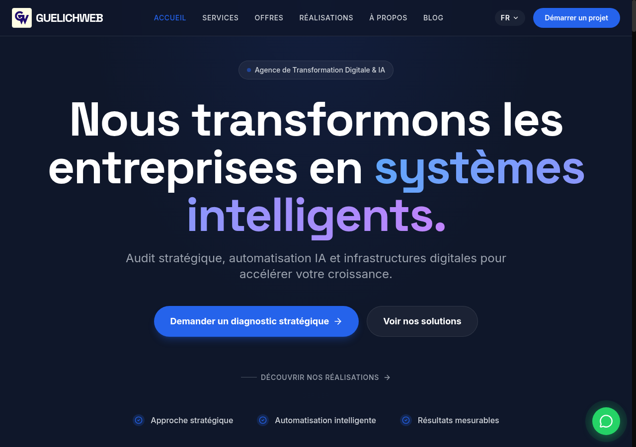
Example of an agency presentation site: guelichweb.online — offer pages, proof, contact. Screenshot from 06/11/2026.
What a showcase website is not
Clear borders prevent fuzzy quotes and painful handovers.
- Not an online store — no product catalogue with Mobile Money / card checkout. If you sell products online, that is e-commerce (optionally with a brand showcase area).
- Not a landing page — a landing is one page built for one campaign and one action. A showcase is a set of pages that represents the organisation continuously. Details: landing vs showcase.
- Not a blog — a blog publishes articles to attract and explain. A showcase *may* include a blog, but that is not its core. See how to create a business blog.
- Not an intranet — an intranet serves staff; a showcase serves the public.
- Not “Facebook / Instagram instead” — social is useful, but you do not control the algorithm, the address or the archive. A website remains your stable base.
If someone sells you “a showcase with cart and payment,” ask them to pick a word: either it is a showcase plus a “order on WhatsApp” button, or it is already light e-commerce. Both are valid — they are not the same scope or the same requirements document.
What a showcase website is really for
The goal is not “to be on the Internet.” The goal is to answer in under ten seconds: Do you do what I need? Do you serve my area? Can I trust you? How do I reach you?
In practice, a well-built showcase helps you:
- Get found — Google, Maps, links from WhatsApp Status or LinkedIn.
- Qualify — the wrong prospect leaves; the right one moves to contact.
- Reassure — proof, method, coverage area, team, legal pages.
- Convert to a human channel — call, WhatsApp, quote, appointment, application, donation.
- Centralise — one stable URL for cards, invoices, donor packs, email signatures.
In Benin and across West Africa, WhatsApp often closes the deal. The site does not replace WhatsApp: it prepares the conversation. That is why we connect site + WhatsApp + follow-up, as in Website, WhatsApp and CRM for SMEs.
Showcase pages that actually work
There is no magic page count. There are content blocks visitors look for. Here is the architecture we recommend most often for an SME or NGO.
1. Home: promise + proof + action
Above the fold (especially on mobile): your craft, your area (Cotonou, Abomey-Calavi, nationwide…), a clear benefit, and one primary button (Call / WhatsApp / Request a quote). Below: 3–5 services, 2–3 proofs (careful metrics, client logos if allowed, reviews), a sample of work, then contact again.
If the home page says everything, it says nothing. A vague line like “innovative solutions for your digital success” converts nobody. “Engineering office in Cotonou — technical control and project support” does.
2. Service pages (one page per real offer)
A single “Our services” dump is convenient for you — not for Google or the client. If you run three distinct crafts (e.g. websites, automation, WhatsApp chatbots), give each a page: problem, deliverables, who it is for, typical timelines, short FAQ, CTA.
That also feeds local SEO: people search “website design Cotonou,” not “holistic digital solutions.”
3. About
Not a romantic biography. Who leads, since when, which method, which guarantees (insurance, certifications when relevant), why you are credible in this market. For an NGO: mission, governance, transparency. For an institution: mandate, oversight, public contacts.
4. Work / References / Portfolio
Real photos and cases — yours. Generic stock of “team smiling at a laptop” kills trust. Even three documented projects (context, action, result) beat a gallery of twenty stock shots. See our portfolio for the principle: named projects, not fiction.
5. Contact (and nothing else on that page)
Clickable phone, WhatsApp link, email, address, hours, map, short form. On mobile the call button must be obvious. If you offer booking, put it here or on service pages — booking tools guide.
6. Legal notice and privacy
Required for professional sites in many frameworks, and anyway essential for trust (especially if you collect form data). See legal notice and privacy policy.
Optional pages that often help
- FAQ — timelines, coverage, quote process, languages, accessibility.
- Service area — real list of cities / countries.
- Careers / Calls for proposals — for NGOs and institutions.
- Resources / light blog — only if you can keep the editorial pace.
- Quote page — a qualification form, distinct from generic contact.
On stable, readable URLs, the classic W3C note still applies: clear, durable addresses humans can understand.
Source: W3C — Cool URIs don't change, screenshot from 06/11/2026.
Showcase website examples by organisation type
The principle stays the same; what visitors look for changes. These are type plans — not invented clients — tuned for Francophone Africa.
Service SME (practice, engineering office, agency, specialised trade)
Typical menu: Home · Services (separate pages) · Work · About · Contact. Dominant CTA: Request a quote or Book a meeting. Proof: project photos / deliverables, Google reviews, logos if allowed. Coverage area is mandatory if you travel.
Local shop that does not (yet) sell online
Home · Catalogue / “see in store” products · Hours & access · WhatsApp contact. CTA: Visit the shop + WhatsApp. The site shows hero stock and confirms the address; the sale closes in person or by message. The day you take online payments, you move to a real store.
NGO / association
Home (mission + careful impact metrics) · Programmes · Reports / transparency · Team · Donate (link to a process or dedicated page — not always a full checkout) · Contact. Donors look for institutional clarity as much as storytelling. A serious NGO site is not a recycled PDF flyer.
School, training centre, institution
Programmes / public services · Calendar · Enrolment / procedures · Notices · Contact. The CTA is often Apply or Download the pack, not “Buy.” Credibility comes from up-to-date information and accessible official documents.
Professional services / health / consulting
Specialties · Patient / client journey · Fees or process (when you can publish them) · Appointment booking · Contact. Here online booking genuinely changes the front-desk day.
Showcase vs landing vs e-commerce vs blog
This is the decision grid we use in diagnostics. It is deliberately short: each format is covered in depth in other guides.
- Showcase — several pages, durable brand, contact / quote / booking. Choose it when your offer sells through trust and conversation.
- Landing page — one page, one offer, one campaign. Choose it for ads, a webinar, a launch. It can complement a showcase, not replace it. → Landing vs showcase.
- E-commerce — catalogue + cart + payment. Choose it when the customer must pay without talking to you. → Online store in Benin.
- Blog / content — articles to attract and explain. Choose it if you keep an editorial rhythm. Often attached to the showcase. → Business blog.
Common failure: an SME runs Facebook ads to the showcase home page… then wonders about cost per lead. Home is not a landing. Either you build a campaign page, or you accept a lower conversion rate.
For a complementary external definition (French market wording), see Shopify’s public article on the *site vitrine* — useful vocabulary, not a West-Africa price truth.
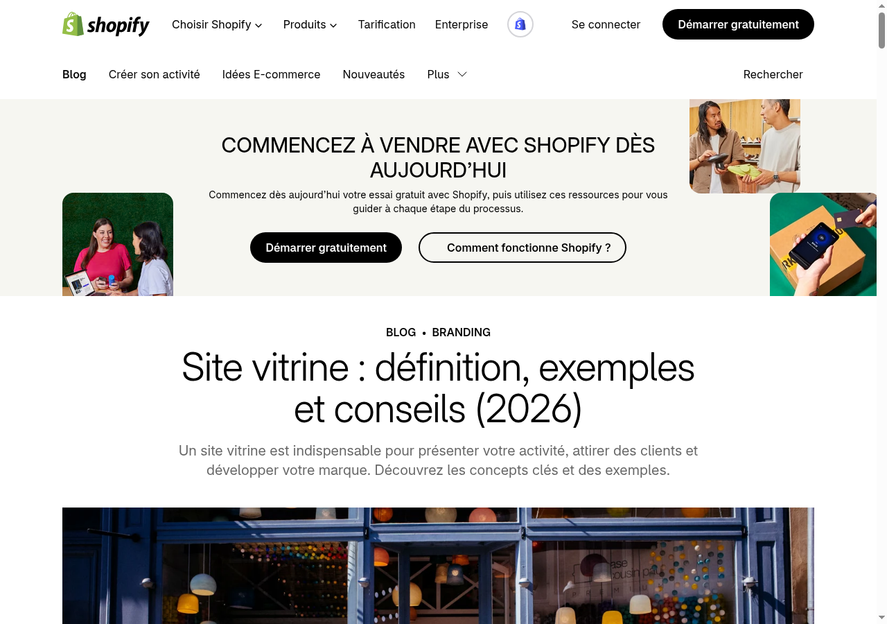
Source: Shopify France — Site vitrine, screenshot from 06/11/2026.
Checklist: is your showcase ready?
- One clear promise on the home page (craft + area + benefit).
- Primary action button visible on mobile without zooming.
- One page per real offer (not one unreadably dense dump).
- Proof: real photos, reviews, careful metrics — no fictional clients.
- Contact details consistent with your Google Business Profile.
- Form or WhatsApp tested end to end (message received, fast reply).
- Responsive behaviour checked on a real phone, not only DevTools.
- Legal notice + privacy published.
- Acceptable load time on 4G (most West-Africa traffic).
- Visual system respected (logo, colours) — see brand guidelines.
How to build it without getting lost
Three common paths:
- DIY on a builder (Wix, Squarespace…) — fast to test, limits when you leave the template. Compare: Wix, Squarespace or custom.
- WordPress — flexible, large ecosystem, maintenance required. → What is WordPress, when to choose it.
- Custom / agency — right when offer, local SEO and integrations (WhatsApp, forms, automation) must match your process.
Before picking technology, write the substance: goals, pages, proof, CTAs, content you will provide. A website requirements document prevents most misunderstandings. Only then discuss stack and timeline.
We build sites meant to convert to contact — not to win a parallax contest. If you are in Cotonou or elsewhere in Benin, the website creation in Cotonou page and our offers describe the frame; the quote still comes after diagnostic.
Frequent mistakes (and how to avoid them)
- Everything on one page — visitors and Google get lost.
- No clear CTA — a pretty site without a button is a PDF brochure in HTML.
- Stock photos only — trust collapses.
- Details that differ from Google Business Profile — you break local SEO.
- Ignoring mobile — majority of traffic.
- Promising e-commerce “later in the same fuzzy package” — scope it in the quote.
- Publish then disappear — a site with no WhatsApp reply within 24–48 h burns leads.
- AI copy with no domain review — the jargon shows; so do your clients.
FAQ — showcase websites
Can a showcase site have a blog?
Yes. Many showcases include a news section. What matters is not turning the project into a content factory if nobody can write every month.
Can you display prices on a showcase site?
Yes, when your craft allows it (clear packages, standardised work). Otherwise explain the quote method and reassure about a free first exchange. We do not invent price grids here: each project gets a diagnostic.
Showcase site or Facebook page?
Both. Facebook / Instagram help discovery; the site remains the base you control (SEO, proof, forms, compliance). Relying only on a network means accepting that your “address” can change tomorrow.
How many pages do you need?
Often 5 to 10 for a service SME: home, 2–4 services, about, work, contact, legal. Six excellent pages beat twenty empty ones.
Should you go bilingual (FR/EN) from day one?
Only if you truly have two audiences. A poorly maintained bilingual site is worse than a strong monolingual one. If you target international donors, plan EN properly — as we do on this blog.
Is a showcase enough to appear on Google Maps?
No. Maps mainly depends on the Google Business Profile + consistent NAP (Name, Address, Phone) + reviews. The site reinforces; it does not replace the profile.
Can you connect a WhatsApp chatbot to a showcase?
Yes, and it is often relevant: the site qualifies, WhatsApp closes. See WhatsApp chatbot and our services.
Conclusion: choose the showcase when trust comes before payment
A showcase website is not “the default low-cost option.” It is the right format whenever your customer needs to understand, compare and trust you — then talk to you — before paying. Trades, practices, NGOs, schools, institutions, agencies: that is often you.
If you must take payment without a conversation, move to e-commerce. If you push a single offer in ads, add a landing. If you want to exist durably as an organisation, start with a clear, mobile, honest showcase and a CTA you can actually honour.
Want to frame a presentation site for your organisation in Benin or Francophone Africa? Tell us about your activity and goals on the contact page — we reply with a diagnostic, then a quote if the project fits. Meanwhile, browse the offers and the blog to prepare your requirements document.