Website homepage: what to include, in what order, and examples for small businesses, NGOs and institutions
G. CHRIST
Published on November 14, 2026
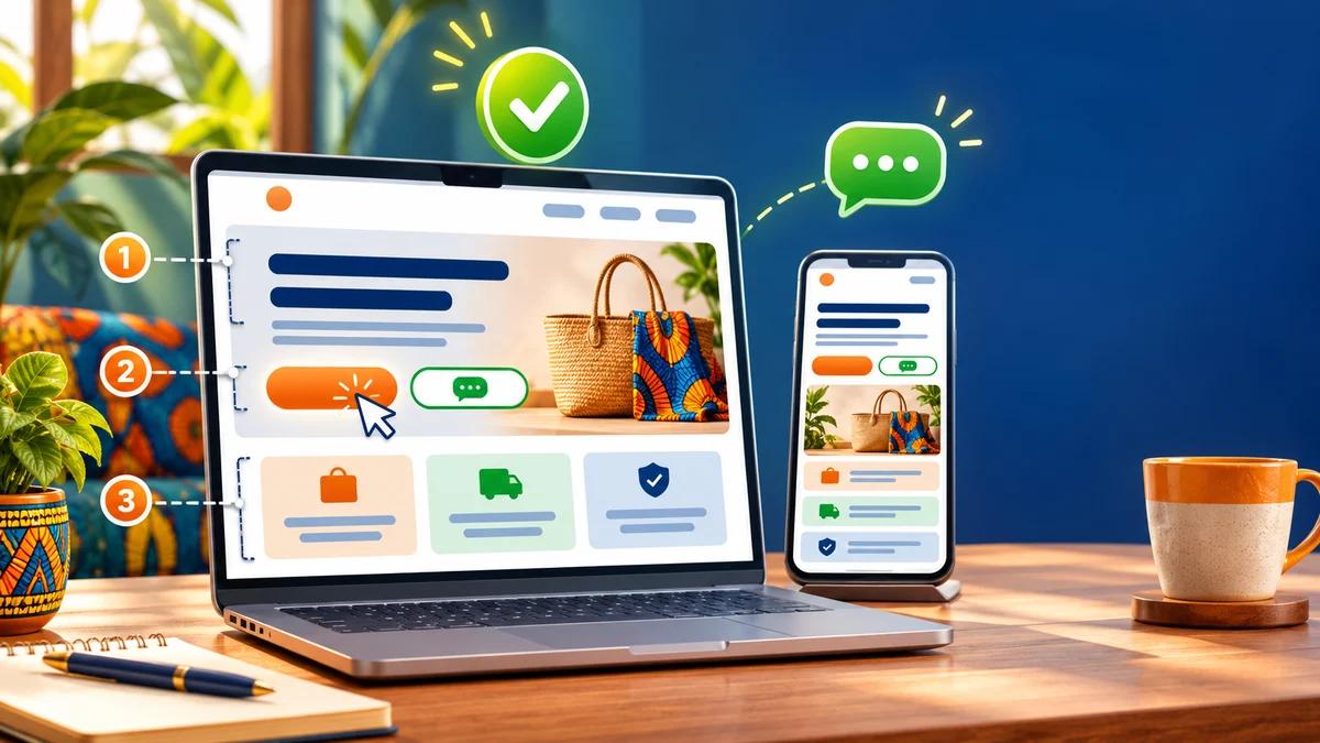
When a small business asks us to “take a look at its website”, the first thing we do is open the homepage on a phone, over 4G, and count. How many seconds before anything appears? How many seconds before we understand what the company does? How many taps before we find a phone number or a WhatsApp button? Far too often, the answer fits in three words: too many, too many, nowhere.
This is not a matter of taste. Your website homepage is the page printed on business cards, pasted into email signatures, shared in WhatsApp statuses and linked from your Google Business Profile. It is usually the page that decides whether a visitor stays or goes back to Google. It is also the page where we see the most decisions made “because it looks nice”: a giant slideshow, a welcome message, a video that plays on its own, a list of fifteen services.
Most of the guides that rank for this topic are written for Europe or North America. They are useful, but they miss what matters in West Africa: a visitor on an entry-level phone with a limited data bundle, who would rather send a WhatsApp message than fill in a form, and who first wants to know whether the business actually exists. Here is our method, block by block, with examples for a small business, an NGO and a public institution.
In short
- A homepage should answer four questions, in this order: am I in the right place? is this for me? can I trust them? how do I take the next step?
- The first mobile screen contains: what you do, for whom and where, in one sentence; one main call-to-action button; one secondary contact option (WhatsApp or a call).
- No auto-rotating carousel, no autoplay video, no “Welcome to our website”.
- Below the first screen: your 3 to 6 offers, each with a link; verifiable proof; the area you serve; a short FAQ; a closing call to action; a complete footer.
- Aim for the main content to render in 2.5 seconds or less (Google’s LCP metric) and test on a real phone, not just on your laptop.
What is a homepage actually for?
People often compare a homepage to a shop window. We prefer the image of a building’s reception desk: you don’t do your shopping there; you check you’re in the right building and get pointed to the right office. A homepage therefore has three jobs, and only three.
- Explain in a few seconds what you do, for whom and where.
- Reassure: show that you are a real, reachable organisation with actual work, customers or beneficiaries.
- Route: send each type of visitor to the right page (a service, a product, a quote form, an annual report, an administrative procedure) or straight to a contact option.
What it is not: a full catalogue, an “About us” page in disguise, or an ad campaign page. If you send Facebook ads to your homepage, you pay for clicks from visitors who can’t find the offer they were promised. A campaign needs its own page; we explain the difference in Landing page: definition and how it differs from a showcase website.
The Nielsen Norman Group, a global reference in web usability, sums up homepage design in five principles: make the homepage easy to reach, say who you are and what you do, reveal content through concrete examples, prompt action and navigation, and keep it simple (NN/g, 2024). Nothing we have seen in the field contradicts these principles. What changes in West Africa is how you apply them.
The first screen decides almost everything
The “first screen” is what visitors see without scrolling. NN/g eye-tracking research found that people spend about 57% of their viewing time above the fold and 74% within the first two screenfuls (NN/g, Scrolling and Attention). In other words, whatever sits at the very bottom of your homepage will be seen by a minority. The order of the blocks is not a design detail; it is a business decision.
On a phone, that first screen is tiny. It should contain this, and nothing more:
- Your logo, top left, readable, with an accessible menu.
- A headline that describes what you do, not a slogan. “Accounting firm for SMEs and NGOs in Cotonou” beats “Excellence at your service”.
- One clarifying sentence: what the customer gets, the area you cover, or what genuinely sets you apart.
- One main call-to-action button with a concrete label: “Request a quote”, “Book an appointment”, “See the menu and order”.
- A secondary contact: a WhatsApp link or a tappable phone number.
- A useful image (your premises, your team, a real product, a project site) rather than a stock photo.
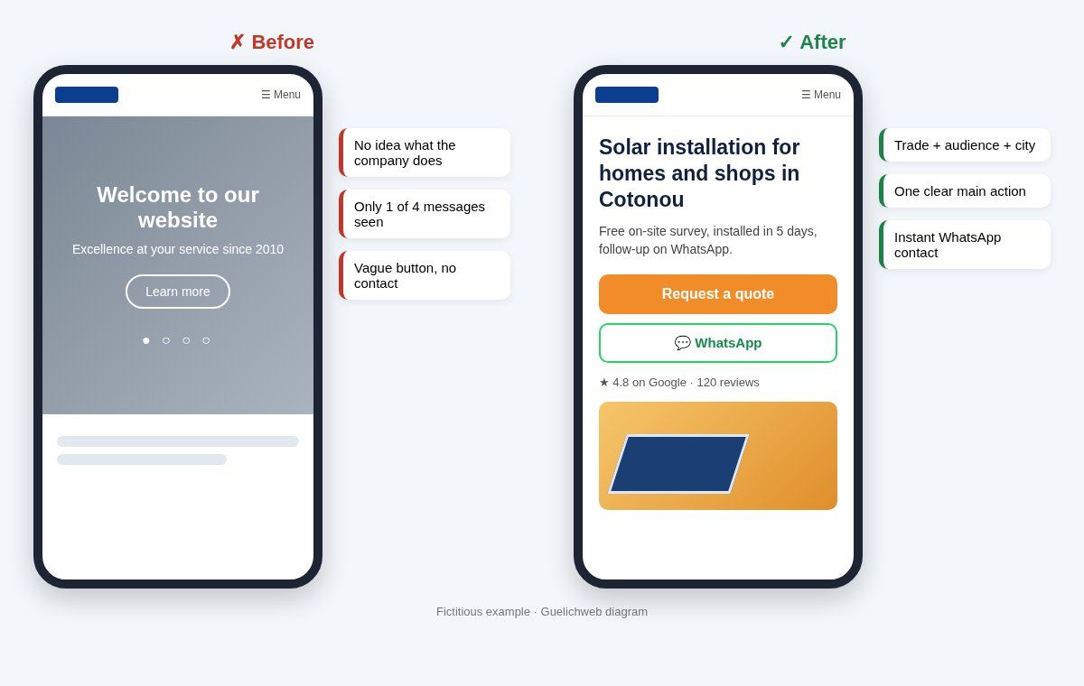
Guelichweb diagram: the same first screen, before and after. On the right, visitors know within three seconds what the business does and how to reach it (fictitious example).
A simple test: show your homepage on a phone to someone who doesn’t know you, for five seconds, then hide the screen. If they can’t tell you what you do and in which city, the first screen needs rework. We run this test in every website audit, and it rarely passes the first time.
The complete homepage structure, block by block
This is the order we recommend for most websites of small businesses, firms, schools and NGOs. It follows the visitor’s logic: understand, check, choose, act.
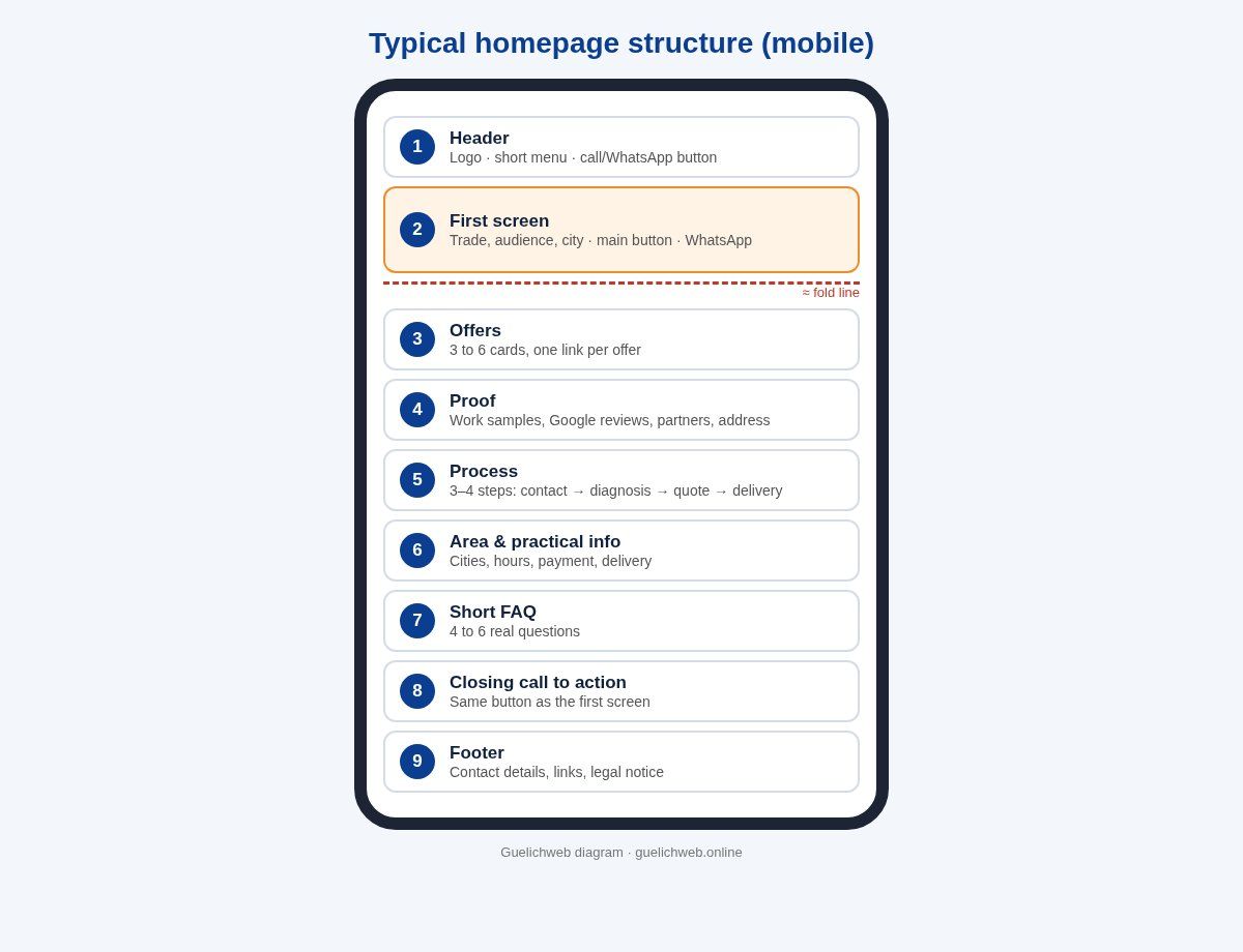
Guelichweb diagram: typical homepage structure for a small business or NGO, as it appears on a phone.
1. The header
Logo on the left, a short menu (five or six items at most) and, on mobile, a call or WhatsApp button that stays visible. Avoid three-level menus: if your menu needs a map, your site architecture needs rethinking.
2. The first screen (the “hero” section)
Headline, clarifying sentence, main button, secondary contact, useful image. One message. If three services are fighting for that space, pick the one that pays the bills and move the others to the next block.
3. Offers or services
Three to six cards, each with a clear title, one concrete sentence and a link to its own page. No “Our innovative solutions”: name things the way your customers name them. NN/g is explicit on this point: specific examples beat vague categories. Every important offer deserves its own page; otherwise the homepage turns into a junk drawer.
4. Proof
This is the most underrated block in our region, even though people are wary online. Proof is verifiable information: visible work with links, genuine Google reviews (see how to get Google reviews), logos of customers or partners who have agreed to be shown, accreditations, your tax or company registration number, a physical address, photos of your real team. “Over 500 satisfied customers” with nothing to back it up proves nothing.
5. Process
Three or four steps: “You message us, we run a diagnosis, we send a quote, we deliver.” This block reassures people who have never worked with a provider like you, which is common for a first website, a first automation project or a first consulting engagement.
6. Area served and practical information
City, neighbourhoods, countries covered, opening hours, delivery or not, remote work or not. It is also a useful local SEO signal, as long as the details match your Google Business Profile exactly; we cover this in What is local SEO and how to rank on Google Maps.
7. A short FAQ
Four to six questions that hold people back before they get in touch: lead times, payment methods, area, what’s included, what to prepare. The answers must be true and specific. A filler FAQ does more harm than no FAQ at all.
8. The closing call to action
For people who read everything without clicking: one sentence and the same button as in the first screen. There is no need to invent a third action.
9. The footer
Full contact details, links to the main pages, social networks you actually use, and your legal notice and privacy policy. Many visitors scroll straight to the bottom to find an address: make sure they find it.
What we almost always remove
A good homepage is also about what you had the courage to take out. These are the elements we remove most often during a redesign.
- The auto-rotating carousel. Everyone in the company wants “their” banner, and visitors only see the first one. NN/g has long documented the problems with auto-forwarding carousels (NN/g). On mobile, they are also heavy to load.
- “Welcome to our website”. This sentence takes the best spot on the page and says nothing. Replace it with what you do.
- Autoplay video. It eats your visitor’s data before they have chosen to watch it. If a video is useful, offer it behind a play button with a lightweight preview image. For accessibility, any moving content lasting more than five seconds must be pausable (WCAG).
- The pop-up on arrival. Newsletter sign-up, promotion, chat: wait until the visitor has seen something first.
- The director’s message and the organisation’s history. They belong on the “About” page, not at the top of the homepage.
- Animated counters (“1,250 projects”) with no source or detail. They look like advertising and slow the page down.
- Embedded Facebook or Instagram feeds. Heavy, often empty or blocked by cookie settings. A link to your profiles is enough.
Adapting your homepage to Benin and French-speaking Africa
This is where European templates show their limits. Four adjustments make a real difference.
Design for the phone and for mobile data
Most of your visitors arrive on a smartphone, often over 3G or 4G, sometimes with an almost empty data bundle. Every megabyte counts. A 3 MB background image in the first screen is money your visitor spends to see your logo. Our rule: a lightweight first screen, resized WebP images, no exotic font loaded in four weights. Google recommends that the main content render in 2.5 seconds or less (the LCP metric, web.dev). Measure your homepage with PageSpeed Insights and read our guide to website speed and Core Web Vitals. Also check how it really looks on several screen sizes: responsive website, how to check.
Make WhatsApp a main action, not a gadget
Here, many customers would rather write on WhatsApp than fill in a form. Don’t hide it in a small green bubble in the bottom-right corner. Offer a clear button using a wa.me link followed by your number in full international format, without the “+”, spaces or dashes, as WhatsApp explains. You can pre-fill a message (“Hello, I’d like a quote for…”) so you know where the lead came from. Still keep a contact form for people who prefer writing or email, and plan what happens next: who replies, and how quickly? If messages pile up, a well-scoped WhatsApp chatbot can handle the first level.
Reassure before you sell
Online scams have made visitors cautious, and that is healthy. Show what proves you exist: a physical address with a link to your Google Business Profile, a landline or business number, your legal identity in the footer, your team’s faces, work samples with links. If you sell online, display accepted payment methods (Mobile Money, cards) and your delivery policy; our article on Mobile Money payment gateways FedaPay and KKiaPay explains how to get paid properly.
Speak your visitors’ language
If part of your audience is English-speaking (partners, donors, customers from Nigeria or Ghana), a visible language switcher and a real English version beat an automatic translation button; see how to translate a website. And in both languages: plain words, no jargon.
Homepage examples by type of organisation
The blocks stay the same; what changes is the main action and the kind of proof. Here are three typical structures (fictitious examples to adapt).
Service business (firm, agency, construction company, clinic)
- Headline: trade + audience + city (“Solar installation for homes and shops in Abomey-Calavi and Cotonou”).
- Main action: “Request a site visit / a quote”; secondary: WhatsApp.
- Proof: photos of projects with locations, Google reviews, accreditations.
- Specific block: a 4-step process with indicative lead times.
Shop or restaurant
- Headline: what you sell + place + how (“Beninese restaurant in Cotonou, dine-in and delivery”).
- Main action: “See the menu and order”; secondary: call.
- Proof: real photos of dishes or products, reviews, opening hours and directions.
- Specific block: payment methods and delivery areas.
NGO or association
- Headline: concrete mission + audience + area (“Safe drinking water for rural schools in northern Benin”).
- Actions: one for partners (“Become a partner” or “Support us”), one for beneficiaries or volunteers.
- Proof: sourced impact figures, recent projects, downloadable annual reports, partner logos shown with permission.
- Specific block: transparency (governance, reports, accounts). Our guide NGO website: what it should include goes into detail.
Public institution or government service
Here the main action is not commercial: it is quick access to the most requested procedures. The first screen should offer a search box and four to six shortcuts to the most consulted services (forms, opening hours, required documents), ahead of the news. Press releases and event photos come afterwards, not in a carousel at the top.
Homepage and SEO: what really matters
The homepage is often the strongest page of your site in Google’s eyes, because it receives the most links. A few concrete points:
- A descriptive title tag: business name + trade + city, rather than “Home”. Google generates the title shown in results automatically from several sources, including the title element and the page’s main heading, and recommends descriptive, concise title elements (Google Search Central).
- A single H1 that states what you do, the same as in the first screen.
- Real text, not just images: a headline baked into an image is unreadable for Google and for screen readers.
- Your site name: Google shows a site name in results, and you can indicate your preference with WebSite structured data on the homepage (Google, site names). For a local business, LocalBusiness structured data (address, hours, phone) is also documented by Google.
- Links to your key pages: each offer on the homepage points to a page that targets its own query. The homepage shouldn’t try to rank for all your keywords at once.
A useful reminder: a beautiful homepage does not replace a well-filled Google Business Profile. For a local business, the two work together.
Writing the copy: a template to adapt
Copy matters more than design. Here is an outline you can fill in within an hour, before you even speak to a designer.
- Headline (8 to 12 words): we [do what] for [whom] in [where].
- Clarifier (1 to 2 sentences): the concrete result for the customer, or what sets you apart in a verifiable way.
- Main button: a verb + what people get (“Get a quote within 48 hours” only if it’s true).
- Offers: for each, a 3-to-5-word title and one sentence describing a real situation.
- Proof: three verifiable items, with links.
- Process: three or four steps, with who does what.
- FAQ: the questions you hear on the phone every week.
- Closing call to action: one sentence restating the benefit, and the same button.
Then read it out loud. Any sentence that could appear on any competitor’s site (“quality”, “professionalism”, “tailored solutions”) should be replaced with a fact. If you are working with a provider, this copy and your colour choices (brand guidelines) are the best things to attach to your website requirements document.
Measuring whether your homepage works
A homepage is judged by what it triggers, not by compliments. With Google Analytics 4, track at least:
- clicks on the main button, the WhatsApp link and the phone number (set up as events);
- the share of visitors who leave from the homepage without any interaction;
- the pages visited right after the homepage: if nobody goes to your offers, the offers block isn’t doing its job;
- the mobile / desktop split, so you know which screen to test first.
Change one element at a time (the headline, then the button label) and compare over several weeks. And simply ask new customers how they found you and what convinced them: that is often more telling than dashboards. If your site gets visits but no enquiries, our article why your website is not bringing customers helps you find the bottleneck.
The 7 mistakes we see most often
- A slogan-style headline that doesn’t say what you do.
- Three buttons of the same colour in the first screen, so none stands out.
- Vague labels: “Learn more”, “Discover”, “Click here”.
- A phone number embedded in an image, impossible to tap to call.
- A broken WhatsApp link (badly formatted number, or an old 8-digit Beninese number).
- Stock photos of people who are obviously not your team.
- A page tested only on the manager’s laptop over fast fibre.
Quick checklist before going live
- Someone from outside passes the five-second test.
- The main button and the secondary contact are visible on a phone without scrolling.
- The WhatsApp link and the phone number work from a mobile.
- Every offer links to its own page.
- All images have alt text and are compressed; also check the accessibility basics.
- The main content renders in 2.5 seconds or less on mobile according to PageSpeed Insights (or you know why it doesn’t).
- Address, hours and phone number are identical on the site and on your Google profile.
- The title tag and the H1 describe what you do.
- Legal notice and privacy policy are reachable from the footer.
How much does a well-built homepage cost?
A homepage is rarely priced on its own: it depends on the site architecture, the number of offer pages, the content available (copy, real photos) and the integrations required (WhatsApp, a form connected to a spreadsheet or CRM, payments). If your site already exists, reworking the homepage and the two or three pages it feeds is often the most profitable project. To know what a serious quote should include, read website cost in Benin.
At Guelichweb, we start with a diagnosis of your current homepage on mobile, then send a tailored quote; this is explained on our offers page. You can also look at our website design services in Cotonou and our portfolio.
Frequently asked questions
What should a website homepage include?
The essentials: what you do, for whom and where; one main call-to-action button; a quick contact option (WhatsApp or phone); your main offers, each linking to its own page; verifiable proof; the area you serve; a short FAQ; a closing call to action and a complete footer.
How long should a homepage be?
Long enough to answer the questions people have before getting in touch, and no longer. For a small business, that usually means six to nine blocks. Attention drops sharply after the first two screens, so whatever is decisive belongs at the top.
Should I use a slider (carousel) on my homepage?
We advise against it in almost every case, especially when it rotates automatically: only one message gets seen, the page gets heavier and accessibility suffers. A static first screen with one clear message works better.
What is the difference between a homepage and a landing page?
A homepage routes every type of visitor to several pages. A landing page serves a single goal (one offer, one campaign, one sign-up) and removes distractions. Ads should point to a landing page, not to the homepage.
Should I show prices on the homepage?
If your prices are simple and stable (a menu, fixed packages), yes, or at least a visible link to a pricing page. If your prices depend on a diagnosis, say so clearly and explain how to get a quote: total silence on pricing drives part of your visitors away.
Can I build a good homepage with WordPress, Wix or a free tool?
Yes. The tool matters less than the structure and the copy. The limits usually come from speed (heavy themes, plugins), control over SEO, and the ability to connect the site to your other tools. Compare before you choose.
Going further
An effective homepage is nothing spectacular: it is clear, fast, reassuring and leads to an action. If you would like an outside view of yours, or you are planning a new website, get in touch through our contact page. We will look at your homepage on a phone, with you, and tell you honestly what to keep, remove or rewrite. For the bigger picture of which kind of site suits you, also read showcase website: what it is and when to choose one and sales funnel: examples.